
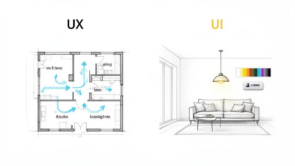
Ever felt tangled in the web of acronyms that is UX and UI? You’re not alone. Let’s cut through the noise with a simple breakdown. UX (User Experience) is the entire feeling a person gets when they use your product. UI (User Interface) is the collection of screens, buttons, and visual bits they actually touch and see.
Think of it this way: UX is the entire journey, and UI is the signposts that guide them.
What Are UX And UI Really?
For a bootstrapped SaaS founder, getting the difference between UX and UI isn’t just a fun fact for a pub quiz—it’s the bedrock of a product people will stick around for. They’re two sides of the same coin, deeply connected but with very different jobs.
Let’s use an analogy that hits closer to home: building a house.
User Experience (UX) Design is the architect’s blueprint. It’s all about the fundamental structure and flow. The architect is obsessed with the big questions that make a house liveable:
- How does someone get from the kitchen to the living room? Is the path logical?
- Is there enough natural light? Is the space used efficiently?
- Does the layout solve the family’s core needs, like having enough bedrooms or a home office?
In the SaaS world, your UX designer is that digital architect. They’re mapping out the entire customer journey, from the first click on your sign-up form to the moment a user feels that “aha!” of success. Their work is less about pretty pictures and more about research, wireframes, and prototypes to ensure your product is intuitive and genuinely solves a problem.
The Role of User Interface Design
Now, User Interface (UI) Design is the interior decorator. With the blueprint set, the UI designer steps in to handle everything you can see and touch. They’re choosing the paint colours, the style of the furniture, the placement of the light switches, and even the texture of the curtains.
In your app, the UI designer brings that architectural vision to life. They focus on:
- Picking a consistent colour palette and typography that feels right for the brand.
- Designing buttons, icons, and menus that are obvious and easy to click.
- Creating a visual hierarchy that draws the user’s eye to what matters most.
A beautiful house with a bizarre layout (great UI, terrible UX) is a nightmare to live in. And a perfectly functional house that looks dull and uninviting (great UX, poor UI) is just plain uninspiring. The magic happens when the blueprint and the decor work together seamlessly.
For a SaaS product to succeed, the strategic flow (UX) must be flawlessly executed through its visual presentation (UI). One can’t save the other; they have to elevate each other.
To make this even clearer, let’s pop the hood and look at what separates them in the day-to-day grind of building a product.
UX vs UI: A Quick Comparison
Here’s a practical table that breaks down the core differences for any founder trying to get a handle on this.
| Aspect | UX Design (The Experience Blueprint) | UI Design (The Visual Execution) |
|---|---|---|
| Primary Goal | To make the user’s journey to solve their problem as seamless and logical as possible. | To create a visually appealing, consistent, and interactive interface for the user. |
| Core Questions | ”Is this feature intuitive?” “How can we reduce the steps to complete this task?" | "Is this button clear?” “Does this colour scheme match our brand?” |
| Key Processes | User research, creating user personas, wireframing, prototyping, and usability testing. | Designing visual mockups, creating style guides, building component libraries, and animation. |
| Typical Deliverable | A low-fidelity wireframe or an interactive prototype showing the product’s flow. | A high-fidelity mockup or a design system with specific colours, fonts, and component styles. |
At the end of the day, incredible UX and UI means your user doesn’t have to think. They can just do. This synergy is what turns a clunky tool into a delightful experience—and that’s the secret to winning and keeping customers in a crowded market.
Why Good Design Is Your Competitive Edge In Southeast Asia
If you’re a bootstrapped founder, every decision feels like a high-stakes bet. Marketing, dev, sales—where do you put your limited time and cash? For too many, design gets shoved to the bottom of the list, filed under “nice-to-have” or “we’ll do it later.”
But in the booming Southeast Asian market, that mindset is a fast track to getting left behind.
Excellent UX and UI aren’t a luxury anymore; they are your single most powerful competitive advantage. This isn’t about making your app look pretty. It’s about survival.
Think about it. When you launch, a killer onboarding flow—guided by smart UX and a clean UI—can be the difference between a trial user who ghosts you and one who pulls out their credit card. An intuitive interface stops users from getting stuck, which means fewer “how do I do this?” support tickets flooding your inbox. For a solo founder, that’s pure gold.
The Business Case for Design
Every hour you don’t spend answering a support question is an hour you can pour back into your product. That’s the direct, tangible ROI of good design. It’s not an expense; it’s a resource multiplier.
Here’s how it cashes out in the real world:
- Slash Customer Churn: An intuitive, frustration-free experience makes users want to stick around. When your app is a joy to use, it becomes essential to their workflow.
- Lower Support Costs: A clear UI means users find what they need on their own. Fewer confused users means fewer support tickets, simple as that.
- Boost Conversion Rates: A seamless onboarding journey (a core UX job) gets users to that “aha!” moment faster, proving your product’s value and making the upgrade a no-brainer.
Good design also builds trust. A polished, professional interface signals that you give a damn about your product and, by extension, your customers. In a crowded market, that perception of quality can be the tie-breaker.
A user who feels smart and capable while using your product is a user who will become a loyal advocate. Frustration is the enemy of retention.
A Market That Demands Quality
The digital scene in Southeast Asia isn’t just growing; it’s exploding. And with that explosion comes a wave of competition and sky-high user expectations, shaped by the world-class apps they use every single day. A clunky, confusing product doesn’t stand a chance.
The numbers back this up. The Asia-Pacific UI/UX design market is set to see the highest growth rate on the planet, hitting a compound annual growth of 33.30% through 2031. This surge is fuelled by a massive population of digital natives and around 887 million mobile connections across the region—that’s 132% of the population, meaning most people have more than one device.
For indie hackers, the takeaway is crystal clear: a mobile-first approach isn’t just a good idea; it’s the only way forward. You can dig into more data on this incredible market growth from industry intelligence reports on Mordor Intelligence.
This growth creates a simple mandate. To win, your SaaS must deliver a polished, mobile-optimised, and culturally-aware user experience.
From Cost Centre to Growth Engine
It’s time for a mental shift. Investing in UX and UI isn’t about spending money to make things look good. It’s about building a fundamentally better, more efficient, and more profitable business from the ground up.
For an indie founder, this means designing a product that sells itself through its sheer ease of use. It means creating an experience so smooth that your users become your best marketing channel. In the fast-paced, mobile-first world of Southeast Asia, superior design isn’t just a feature—it’s your most sustainable engine for growth.
Right, so you’ve got a handle on the difference between UX and UI. What’s next? Actually putting that knowledge to work. For a bootstrapped SaaS, killer UX isn’t about throwing money at a massive design team. It’s about being smart and focusing on what genuinely matters to your users.
This boils down to building your product on three solid pillars that create an experience that’s smooth, valuable, and keeps people coming back. We’re talking about effective user onboarding, crystal-clear product communication, and a non-stop feedback loop. Get these right, and you’ll have a product that feels like it just gets its users from the moment they sign up.
Pillar 1: Effective User Onboarding
First impressions are everything. Seriously. Onboarding is that make-or-break window where a curious trial user decides if your product is worth sticking with. Your mission, should you choose to accept it, is to guide them to their “aha!” moment as fast as humanly possible. That’s the instant they truly get the value you’re offering.
A clunky onboarding experience is one of the biggest reasons people churn. If someone feels lost or overwhelmed in the first five minutes, they’re gone. Probably for good.
To head this off, keep things simple and guided. Think in-app checklists that break down the setup into tiny, satisfying steps. Each ticked box gives a little dopamine hit and pulls the user deeper into your product. Contextual tooltips are another secret weapon, popping up with help exactly when and where it’s needed without making the interface feel cluttered.
Pillar 2: Clear Product Communication
Once a user is settled in, your work isn’t done. The best UX and UI go way beyond the initial setup. It’s about keeping users in the loop for their entire journey with your product. That’s where clear, consistent communication comes into play.
How do you announce that awesome new feature you just shipped? An in-app announcement widget or a clean changelog is a million times better than an email that’s just going to get buried.
These little updates do more than just inform; they show momentum. When users see you’re constantly fixing bugs and adding improvements, it builds massive confidence. It tells them they’ve backed the right horse—a product that’s alive and kicking.
Seeing regular progress proves you’re listening and working to make their lives better. That kind of trust is priceless for long-term loyalty.
Pillar 3: Continuous Feedback Loops
This last pillar might just be the most important one: building a system to constantly listen to your users. You can’t fix problems you don’t even know exist. A continuous feedback loop is your direct hotline to what people are thinking and feeling, letting you squash frustrations before they boil over.
And it doesn’t have to be complicated. Simple tools like a Net Promoter Score (NPS) survey can give you a quick pulse check on customer happiness with just one question.
For the nitty-gritty details, make it dead simple for users to submit feature requests or report bugs. The goal is to make giving feedback feel like zero effort.
This infographic shows exactly how a solid design edge, built on these pillars, translates into real business results.
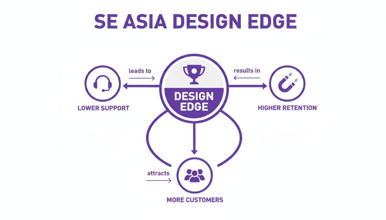
It’s pretty clear: investing in these UX pillars directly cuts down your support tickets while boosting customer loyalty and bringing in new business.
These three pillars—onboarding, communication, and feedback—aren’t just separate items on a to-do list. They’re a connected system. Great onboarding means fewer confused users needing support. Clear communication keeps them engaged. And feedback gives you the roadmap for what to build next. If you want to go deeper on this, check out our guide on implementing continuous product discovery.
For a founder flying solo, juggling different tools for each pillar can be a nightmare of costs and complexity. That’s why an all-in-one platform like HappyPanda is so helpful. It rolls onboarding checklists, changelogs, and feedback surveys into one simple, affordable package, so you can nail these best practices without the usual headache.
Right, we’ve covered the big-picture strategy of UX. Now it’s time to get our hands dirty with the UI.
You don’t need a design degree to spot the obvious problems holding your interface back. A quick, honest look at your own product can uncover simple fixes that make a world of difference for your users. Think of it as a sanity check for your software.
To make this dead simple, I’ve put together a lean audit checklist. It’s built for founders and developers—the folks who are actually building the thing, not just theorising about it. Use these questions to look at your SaaS with fresh eyes.
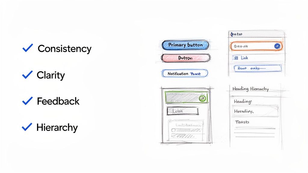
The Lean UI Audit Checklist
This isn’t an exhaustive design review. It’s a rapid-fire check to catch the most common (and most damaging) UI mistakes that indie founders make. Run through these questions and see where your product stands.
| Category | Audit Question | Why It Matters for SaaS |
|---|---|---|
| Consistency | Are all primary action buttons (e.g., “Save,” “Add New”) the same colour and style? | Trains users to recognise key actions instantly, making core workflows feel automatic and reducing hesitation. |
| Consistency | Do clickable links look the same across the entire app? | Users shouldn’t have to guess or hover to discover what’s clickable. A uniform style removes ambiguity and frustration. |
| Clarity | Is it immediately obvious what each button or icon does without a tooltip? | Vague labels like “Submit” create confusion. Action-oriented text like “Create Invoice” is always better and boosts user confidence. |
| Clarity | Is all the text on your interface easy to read? (Check font size and colour contrast.) | Poor contrast or tiny fonts cause eye strain and can make your app feel inaccessible, frustrating users without them even knowing why. |
| Feedback | Does the interface visibly react when a user clicks a button? (e.g., loading spinner, colour change) | Without feedback, users wonder if they clicked correctly or if the app froze. This prevents them from rage-clicking. |
| Feedback | Are there clear success messages (e.g., “Settings Saved!”) or specific error messages? | A simple “Success!” provides assurance. A helpful error like “Email is invalid” guides the user instead of just saying “Error.” |
| Hierarchy | Does the most important element on the page draw your eye first? | On a pricing page, the “Start Trial” button should pop. A strong hierarchy guides users to the actions you want them to take. |
| Hierarchy | Are headings and subheadings used to break up text and create a scannable structure? | Users don’t read; they scan. Proper headings make your content digestible and help users find what they need, fast. |
This checklist gives you a solid starting point. Each “no” is an opportunity for a quick win that will immediately improve your user’s experience. And remember, making users happy is the whole point—you can even measure user satisfaction to see how these small UI tweaks are paying off.
Great UI isn’t about winning design awards; it’s about making your user feel smart and capable. When your interface is clear and predictable, the user feels in control.
The Bootstrapper’s Design Toolkit and Workflow
Building a slick product with great UX and UI doesn’t mean you need a bottomless budget or a massive design team. For bootstrapped founders, the real secret is a lean, mean stack of tools and a workflow that turns user feedback into product improvements, fast.
The goal here is to dodge complexity. You need a simple, repeatable process that lets you focus on solving actual user problems instead of getting lost in a sea of software. This is all about building momentum without breaking the bank.
A smart toolkit for an indie hacker really just needs to cover three core areas: design, development, and that all-important customer communication loop.
Crafting a Lean Tool Stack
For most SaaS founders, a powerful yet simple toolkit is all you need to build something that looks and feels professional-grade. You can get fantastic results with just a few well-chosen tools that play nicely together.
Here’s a recommended lean stack for any solo founder:
- Design and Prototyping: A user-friendly tool like Figma is the industry standard for good reason. Its free tier is incredibly generous, letting you create high-fidelity mockups, design systems, and interactive prototypes all in one spot.
- Development Speed: A pre-built component library like Tailwind UI is an absolute game-changer. Instead of building every button, modal, and form from scratch, you get professionally designed, production-ready components you can drop right into your project.
- The Communication Hub: An all-in-one platform like HappyPanda is the glue holding your workflow together. It handles your user onboarding, in-app announcements, and feedback collection, creating a direct line between you and your customers.
This setup gives you everything needed to design, build, and iterate on your product without wasting a minute. For bootstrappers looking to get ahead, exploring the best AI UI UX tools can give you a serious competitive edge.
Having a centralised system like this ensures visual consistency across your app and dramatically speeds up the entire design process.
The Feedback-Driven Workflow Loop
Once you have your tools sorted, the next step is nailing down a simple, repeatable workflow. This closed-loop process ensures you’re always building what users actually need, making every development cycle count.
The most effective workflow for a bootstrapper isn’t about elaborate processes. It’s a tight, fast loop: listen, design, build, announce, and measure. Then do it all over again.
Here’s a practical, five-step loop you can put into action today:
- Gather Feedback: Use a tool like HappyPanda to send out targeted NPS or custom surveys to your users. Find out what they love and, more importantly, where they’re getting stuck.
- Identify a Pain Point: Dig through the feedback and spot a common theme. Is there a confusing part of your interface? A missing feature people keep asking for?
- Mock Up a Solution: Jump into Figma and design a simple, elegant solution to that one specific problem. Create a quick mockup to visualise how it will look and function.
- Build It Fast: With your design ready, use your component library to build the feature quickly. This stops you from reinventing the wheel and gets the solution into users’ hands way faster.
- Announce and Measure: Once the update is live, use a changelog widget to announce the improvement. Keep an eye on your feedback channels to see the impact and start the loop all over again.
This approach makes the whole UX and UI process feel manageable and directly ties your hard work to user happiness.
Bringing UX and UI Together to Build Something People Love
Alright, we’ve unpacked the blueprint of User Experience and the visual craft of User Interface design. Now, let’s put the pieces together, because this is where the magic really happens. The partnership between UX and UI isn’t just some textbook theory; it’s the engine that powers a product from launch to long-term success.
Think of it this way: UX is your grand strategy, the map that guides your user from point A to point B. The UI is the beautifully paved road, the clear signposts, and the comfortable ride that makes the journey a delight.
For any SaaS to make it, especially in a crowded market, these two have to be in perfect harmony. A genius user flow is completely wasted if the buttons are a confusing mess. And a stunningly beautiful interface will only lead to rage-quits if it’s a dead end. This synergy is what separates products people adore from those that just fade away.
The best part? You don’t need a massive budget or a dedicated design department to get this right. As an indie founder, creating a product that users genuinely enjoy is completely within your reach.
Your Path to a User-Adored Product
The secret is to keep it simple and focus on the core principles. It’s about using lean tools and, most importantly, making a relentless commitment to listening to your users. Building that constant dialogue is what will set your product apart. And to keep things fresh and effective, it’s always a good idea to keep an eye on the latest Top UI/UX Design Trends.
You don’t need to be a world-class designer to build a world-class experience. You just need to be a world-class listener.
This is exactly where we come in. HappyPanda was built to be your partner on this journey, giving you an essential, affordable platform to nail these world-class UX practices. From creating smooth onboarding flows to keeping communication clear and, of course, closing the feedback loop, we put all the tools you need under one roof. Stop juggling a dozen expensive subscriptions and start building the user-centric product you’ve always envisioned.
Your Burning Questions About SaaS Design, Answered
Jumping into the world of UX and UI can feel like a lot, especially when you’re a founder already wearing ten different hats. Let’s cut through the noise and tackle some of the most common questions bootstrapped builders have. These are practical, no-fluff answers to help you get moving.
How Much Should I Actually Budget for Design?
For an early-stage bootstrapper, the honest answer is probably close to zero in cash, but it will cost you some time. Forget about hiring a pricey agency right now. Instead, think of your “budget” as smart investments in tools that give you the most bang for your buck.
This means finding a solid component library to avoid building every button and modal from scratch. It also means using platforms that bundle multiple features, like user feedback and onboarding guides, into one. The goal isn’t a pixel-perfect masterpiece on day one. It’s about getting a clean, working interface out the door and then letting your real users tell you what to fix.
So, When Do I Hire a Professional Designer?
The right time to bring in a pro is when you’ve hit product-market fit and have a steady stream of revenue. Once you’re there, a skilled designer isn’t just a cost—they’re an investment with a clear ROI. They can dive deep into your user experience, smooth out friction points to reduce churn, and optimise your conversion funnels.
Until that day comes, your mantra should be “good enough” design. Stick to established patterns, keep your interface brutally simple, and listen—really listen—to what your first users are saying. Some of the most successful SaaS products out there started with founder-led design.
Don’t let the hunt for design perfection become a clever way to procrastinate. Your number one job is to build something that solves a painful problem. The polish can come later.
I Have Zero Design Experience. Where on Earth Do I Start?
You’re not alone! Starting from scratch is way more common than you’d think. The secret is to stop trying to reinvent the wheel. Focus on the timeless fundamentals, not whatever flashy trend is hot on Dribbble this week.
Here are three simple steps to get you started:
- Become a student of patterns: Go look at successful SaaS products, both in your industry and outside of it. How do they handle navigation? What do their forms and buttons look like? These patterns are everywhere for a reason: they just work.
- Choose clarity over creativity: This is a big one. Use a simple colour scheme, a font that’s easy to read, and don’t be afraid of white space. Your main goal is to make your app intuitive, not to win an art award.
- Lean on a component library: This is the ultimate shortcut. Tools like Tailwind UI give you a massive head start with professionally designed, accessible components. It’s the fastest way to get a polished, consistent look without being a designer yourself.
By sticking to these basics, you’ll build a solid UX and UI foundation that ensures your users have a great, frustration-free experience from the moment they sign up.
Ready to implement world-class onboarding, feedback, and communication without the complexity? HappyPanda combines all the tools you need into one simple, affordable platform. Start building a product your users will love. Get started today at https://happypanda.ai.