
To really get a handle on user satisfaction, you can’t just look at one thing. It’s about mixing the hard numbers—like NPS and CSAT scores—with the real, human stories you get from open-ended questions and interviews. This combo gives you the full picture, helping you understand why users feel the way they do, not just what they scored you.
Why User Satisfaction Is Your Most Important Metric
Let’s drop the idea that user satisfaction is just some fluffy, ‘nice-to-have’ metric. It’s actually one of the sharpest predictors of your company’s future success. When you consistently track how people feel about your product, you’re directly measuring the health of your retention, revenue, and brand. Happy users don’t just stick around; they upgrade and tell their friends. It’s that simple.
Too many companies fall into the same old traps. They either chase vanity metrics that don’t mean much or collect a mountain of feedback that just gathers dust in a spreadsheet. That’s a reactive approach, treating satisfaction like a report card from last semester. The real goal is to flip that script: user satisfaction should be a proactive tool that steers your product roadmap and your entire business strategy.
The Real Cost of Ignoring User Feedback
Tuning out your users, or just plain misreading the room, has very real consequences. There’s often a massive gap between how companies think they’re doing and what customers are actually experiencing. For example, research shows that while most companies believe customer loyalty is on the rise, only 40% of consumers actually agree.
That disconnect is expensive. A staggering 52% of consumers say they’ve walked away from a brand after a single bad product experience. You can dig into more of these eye-opening stats in the PwC 2025 Customer Experience Survey.
This isn’t just about feelings; it’s about revenue walking out the door. When users aren’t happy, they churn.
Blending Quantitative and Qualitative Insights
To truly measure satisfaction, you need to understand both the “what” and the “why.” This means bringing two types of feedback together:
- Quantitative Feedback: This is your numerical data—think Net Promoter Score (NPS), Customer Satisfaction (CSAT), and Customer Effort Score (CES). These scores give you a bird’s-eye view of trends and let you benchmark your progress.
- Qualitative Feedback: This is the story behind the numbers. It comes from the open-ended comments in surveys, user interviews, and support tickets. This is where you find the gold—the specific pain points, killer feature ideas, and raw emotions a score could never capture.
Relying on numbers alone is like looking at a map without any landmarks. You can see the general direction, but you have no idea what the journey actually feels like for your users.
When you combine these two, you get a complete, holistic view. A sudden drop in your CSAT score is the smoke alarm, but the qualitative comments are what tell you exactly where the fire is. Getting why user satisfaction is so crucial is the first step, and from there you can explore proven strategies to improve customer experience that build real loyalty and drive growth.
Choosing the Right Satisfaction Metrics for Your Business
Once you’re sold on why you need to measure user satisfaction, the real fun begins: picking your tools. This isn’t about just grabbing acronyms out of a hat. It’s about being strategic—selecting the right metric for the right job at the right time.
A metric for gauging in-the-moment happiness after a quick support chat is a completely different beast than one designed to measure long-term brand loyalty. There’s no single “best” metric. An e-commerce store chasing repeat purchases and a SaaS platform focused on user adoption have different worlds, different user journeys, and different questions to answer.
The trick is to build a toolkit that gives you the complete picture, blending those hard, quantifiable numbers with the human stories behind them.
This decision tree can help you visualize which path to take. Are you looking for a quick gut-check on a single transaction, or are you trying to understand the overall health of your customer relationships?
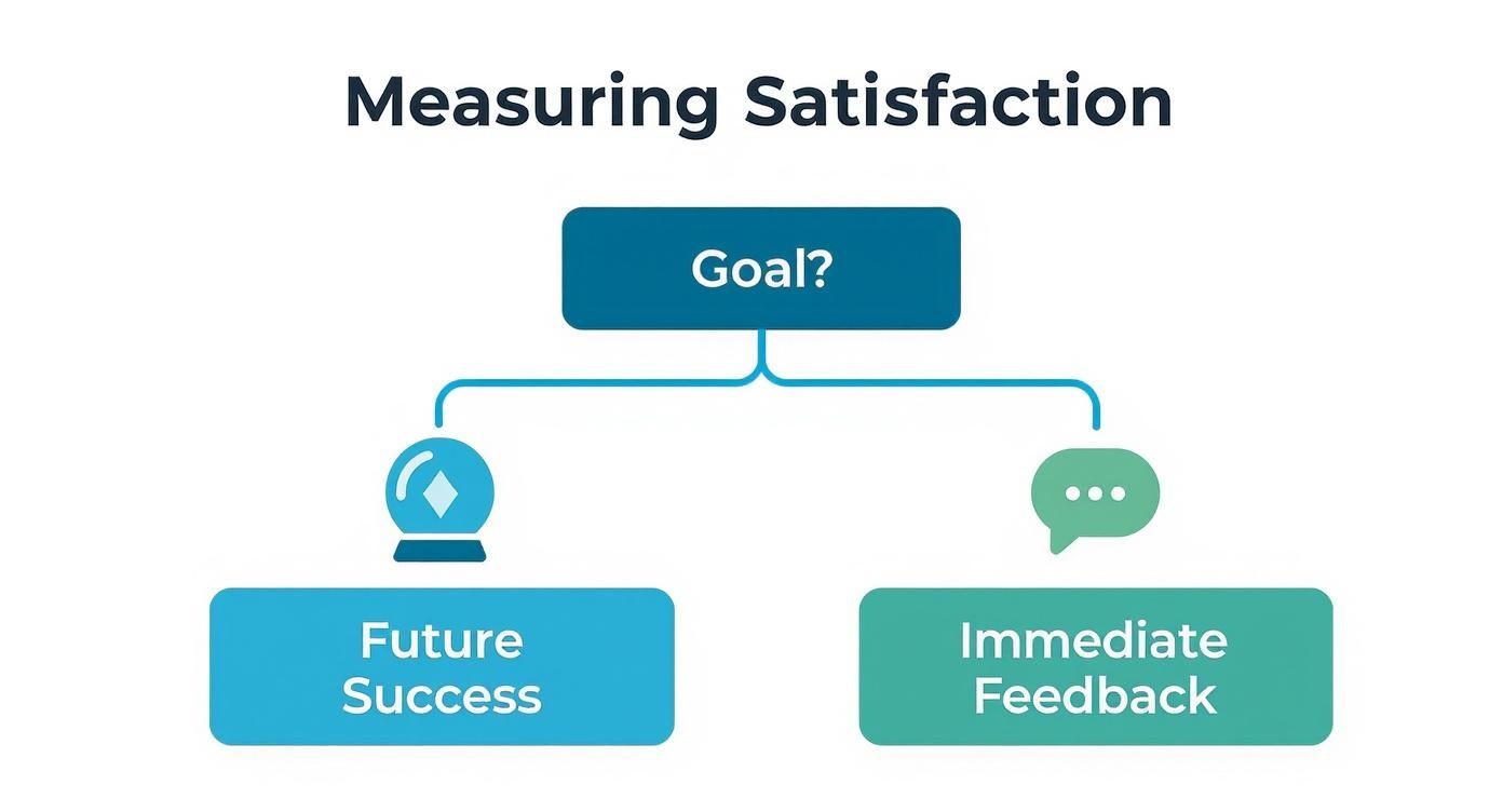
As the graphic shows, your primary goal is the fork in the road, leading you toward entirely different metrics for different situations.
Comparing Key User Satisfaction Metrics
To help you choose, let’s break down the most common metrics. Think of this table as your quick-reference guide for figuring out what each one does and when to deploy it.
| Metric | What It Measures | Best Used For | Example Question |
|---|---|---|---|
| CSAT | Immediate, in-the-moment satisfaction with a specific interaction or feature. | Post-support tickets, after a purchase, or following a new feature interaction. | ”How satisfied were you with this experience?” (Scale: 1-5) |
| NPS | Long-term customer loyalty and willingness to advocate for your brand. | Quarterly/biannual health checks, or after key journey milestones (e.g., 90 days post-onboarding). | ”How likely are you to recommend our company to a friend or colleague?” (Scale: 0-10) |
| CES | The ease of a user’s experience when trying to accomplish a specific goal. | After a user navigates help docs, completes checkout, or gets an answer from support. | ”How easy was it to resolve your issue today?” (Scale: Very Difficult to Very Easy) |
Each metric tells a unique part of the story. Use them in combination, and you’ll get a far richer, more complete understanding of your user experience.
The Big Three Quantitative Metrics
Most teams build their user satisfaction strategy around three core metrics. Each one answers a very different, very important business question.
Customer Satisfaction Score (CSAT)
CSAT is your go-to for a quick pulse check. It measures in-the-moment happiness with a specific interaction, like using a feature or talking to support. It’s direct, simple, and asks a straightforward question like, “How satisfied were you with this?” on a 1-5 scale.
- When to use it: Right after a support ticket is resolved, immediately following a purchase, or after a user tries out a brand-new feature.
- Real-World Example: A project management tool rolls out a new calendar view. They can trigger an in-app CSAT survey for anyone who has created three or more events, asking specifically about their satisfaction with that new feature.
Net Promoter Score (NPS)
NPS zooms out from transactional happiness to measure long-term loyalty. It asks the ultimate question: “How likely are you to recommend [our company] to a friend or colleague?” on a 0-10 scale.
Your users are then grouped into Promoters (9-10), Passives (7-8), and Detractors (0-6). Your final score is simply the percentage of Promoters minus the percentage of Detractors.
- When to use it: Periodically (think quarterly or bi-annually) to gauge overall brand health, or after key milestones like 90 days post-onboarding.
- Real-World Example: An e-commerce brand sends an NPS survey to customers who have made at least two purchases. The goal isn’t just to see if they were happy with their last order, but to find out if they’re building a base of loyal advocates who will drive word-of-mouth growth.
Customer Effort Score (CES)
CES gets straight to the point: how easy was it for a user to get their job done? The question is as simple as, “How easy was it to resolve your issue today?” answered on a scale from “Very Difficult” to “Very Easy.”
Don’t underestimate this one. Research consistently shows that reducing customer effort is a massive driver of loyalty. In fact, over 90% of customers who report low effort will purchase from that same company again.
- When to use it: After any interaction where the user is trying to accomplish a task—navigating your help docs, completing checkout, or getting an answer from your support team.
- Real-World Example: A fintech app triggers a CES survey after a user successfully links a new bank account. A low effort score here is a huge win, telling the product team the user experience is smooth and well-designed.
Think of it this way: CSAT measures happiness, NPS measures loyalty, and CES measures ease. Using all three gives you a multi-dimensional view of your user experience.
Don’t Forget the “Why”: Go Qualitative
Numbers tell you what is happening, but they almost never tell you why. This is where qualitative feedback becomes your most valuable asset. It’s the context, the emotion, and the specific details that turn a sterile score into an actionable story.
Without it, you’re just guessing. A plunging NPS score is a warning sign, sure, but it’s the open-ended comments that follow that tell you exactly which part of the engine is on fire.
Here are a few ways to capture that crucial context:
- Open-Ended Follow-Ups: Always, always, always include a “Why did you give that score?” follow-up question with your CSAT, NPS, and CES surveys. This is where the gold is buried.
- User Interviews: A single 30-minute conversation with a power user (or even a really frustrated one) can deliver more actionable insights than a thousand survey responses.
- In-App Feedback Widgets: Tools like HappyPanda give users a direct line to you. They can submit bug reports, ideas, and general comments whenever inspiration—or frustration—strikes.
To get a fuller picture, it’s also smart to look at key user engagement metrics. This data can add another layer of context to the feedback you’re collecting.
Knowing which questions to ask is a skill in itself. For some inspiration, check out our guide on different questions for feedback. Asking smarter questions gets you better, more actionable data to drive real product improvements.
How to Design and Time Your Surveys for Better Responses
You can ask the perfect question, but if you ask it at the wrong time, you’ll likely get crickets or, worse, garbage data. To really get a pulse on user satisfaction, you have to master the art of timing. Your request for feedback should feel like a natural part of their journey, not some jarring interruption.
Think of it as joining a conversation already in progress instead of shouting a question from across the room. The goal is to make the experience so seamless that users want to respond because the request just makes sense in that moment.
Crafting Questions That Get Real Answers
Before you even think about timing, your survey design has to be airtight. Every single question needs to be intentional, crystal clear, and free of bias. A poorly phrased question can send your results sideways and lead your team down a completely wrong path.
Here are a few core principles I stick to when designing survey questions:
- Be Specific: Instead of a vague “How was your experience?”, ask something pointed like, “How easy was it to find the information you were looking for today?” Specificity gets you targeted, actionable feedback.
- Avoid Leading Questions: Never, ever phrase a question in a way that nudges a user toward the answer you want. “How much did you enjoy our amazing new feature?” is loaded with bias. A neutral, “What are your thoughts on our new feature?” is infinitely better.
- Balance Scales and Open Text: Rating scales (like CSAT or NPS) are fantastic for quantitative tracking, but they don’t tell the whole story. Always tack on an optional, open-ended follow-up, like, “Could you tell us a bit more about why you chose that score?”
If you’re looking for more ideas, our guide on crafting effective customer feedback forms has plenty of examples to get you started.
Finding the Sweet Spot for Survey Length
The golden rule here is simple: respect the user’s time. The longer your survey, the more people will bail halfway through. For most in-app feedback, you should be aiming for something that takes less than a minute to complete.
A single, well-timed question is infinitely more valuable than a ten-question survey that no one ever finishes. Prioritize getting one crucial piece of data over asking for everything at once.
If you absolutely need more detailed feedback, just be upfront about it. A longer email survey sent to your power users is fine, but you need to set expectations clearly. Something like, “This 5-minute survey will help us shape our product roadmap,” works wonders.
The Art of Timing and Triggers
Okay, this is where you go from gathering good data to gathering great data. Context is everything. When you trigger surveys based on specific user actions, you get feedback while the experience is still fresh in their mind. This move alone can dramatically boost both response rates and the quality of the insights.
Here are some real-world scenarios for timing your surveys:
- The “Aha!” Moment: When a user successfully uses a key feature for the first time—like exporting their first report or inviting a new team member—that’s the perfect time to pop a Customer Effort Score (CES) survey. A simple “How easy was that?” captures their immediate impression.
- The Post-Support Check-In: The second a support ticket is marked as resolved is the ideal moment to send a Customer Satisfaction (CSAT) survey. This gives you direct, in-the-moment feedback on your support team’s performance.
- The 30-Day Loyalty Check: Don’t hit a brand-new user with a Net Promoter Score (NPS) survey. It’s pointless. Wait until they’ve had enough time to actually experience your product. Triggering an NPS survey 30-60 days after they’ve onboarded will give you a much more accurate read on long-term loyalty.
Using event-based triggers like these ensures you’re always asking the right question at the most relevant time. It not only improves your data but also shows your users you understand their journey. As a recent Qualtrics 2025 Global Consumer Study pointed out, companies need to do more than just meet expectations; they need to foster true loyalty, and this kind of thoughtful engagement is a big part of that.
Turning Raw Feedback into Actionable Insights
Collecting feedback is the easy part. The real work begins when you’re staring at a pile of raw data—scores, numbers, and a whole lot of opinions. Without a solid plan, that goldmine of feedback quickly turns into noise, and you’re left with numbers that don’t actually tell you anything.
The goal isn’t just to report a score. It’s to find the story hidden inside the data. You need to dig past the averages and understand who is saying what, and most importantly, why they feel that way. This is the difference between simply measuring satisfaction and actually being able to do something about it.
Segment Your Data to Find the Real Story
Let’s be honest: your users aren’t a monolith. A power user who’s been with you for three years thinks very differently than a rookie fumbling through their first week of onboarding. Lumping their feedback together just gives you a blurry, misleading average that masks the real problems.
This is where segmentation becomes your superpower. Slicing your data into meaningful user groups lets you pinpoint specific issues and opportunities that would otherwise stay hidden.
- By User Tenure: Pit new users (first 30 days) against your veterans (90+ days). You’ll quickly spot if onboarding is a mess or if your long-time fans are getting frustrated with advanced features.
- By Plan Type: How do free users feel compared to those on your premium plans? This is a fantastic way to find out which features are actually driving upgrades and what pain points might convince someone to finally pull out their credit card.
- By User Activity: Group users by how often they log in or use key features. Are your “power users” happier than the casual visitors? If your most engaged users are suddenly giving you low scores, that’s a massive red flag for churn.
Imagine your overall CSAT score takes a nosedive. Without segmentation, you’re flying blind. But by digging in, you might discover the drop is entirely driven by users on your “Pro” plan who all hate the new billing page. Suddenly, you have a clear, actionable problem to solve instead of just a vague sense of dread.
Dig into Qualitative Feedback for the “Why”
While numbers tell you what’s happening, the open-ended comments tell you why. This is where you find the context, the emotion, and the juicy details that a simple score could never capture. Honestly, a simple “Why did you give that score?” follow-up is often the most valuable question you can ask.
To make sense of all that text, you’ll want to do some thematic analysis. The goal is to spot recurring patterns, ideas, and frustrations in the comments.
- Get a Feel for It: First, just read through a random sample of responses. Get a general sense of the mood. Are people confused? Delighted? Annoyed?
- Tag Everything: Start creating tags for common themes. These could be product areas (
#billing,#ui-design), feedback types (#bug-report,#feature-request), or even sentiments (#frustration,#positive-surprise). - Count Your Tags: Once you’ve tagged a good chunk of feedback, see which themes pop up most often. You might discover that 25% of all negative comments mention the word “confusing” when talking about your new dashboard.
Boom. You’ve just turned a wall of text into structured data. Now you can confidently walk into a team meeting and say, “The new dashboard is too complex,” and have the evidence to prove it.
The most powerful insights often live at the intersection of quantitative and qualitative data. A low score points you to the problem area, and the user’s comment tells you exactly what needs fixing.
Set Benchmarks That Actually Matter
As soon as you start tracking scores, someone is going to ask, “So… is that a good score?” It’s tempting to immediately Google “average NPS for SaaS,” but comparing yourself to broad industry averages is often a fool’s errand. A “good” score for a telecom company would be a disaster for a beloved consumer brand.
Just look at the numbers. The telecommunications sector, for example, scrapes by with an average Net Promoter Score (NPS) of just 31. Meanwhile, in retail, only 14% of consumers are satisfied with their e-commerce experiences. These stats, which you can explore further in this breakdown of industry benchmarks on plivo.com, show just how wildly expectations can vary.
Use those external numbers for a bit of context, but don’t treat them as your report card.
The most important benchmark is your own historical data. The real goal isn’t to beat some arbitrary industry average; it’s to get better, month over month. Focus on moving your own baseline scores up and to the right. That internal progress is the only true measure of whether your efforts are actually paying off.
Building a Feedback Loop Your Team Will Actually Use
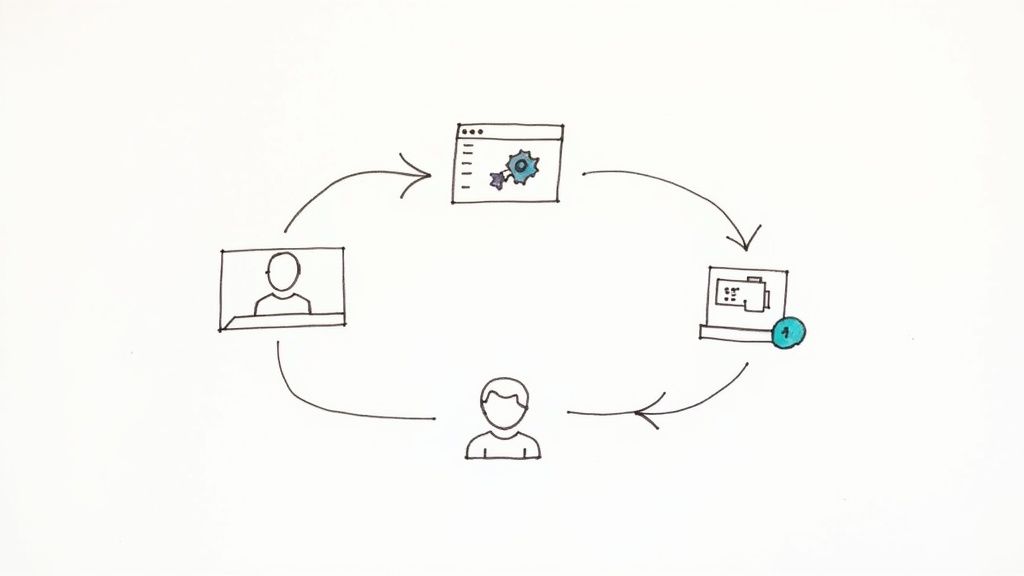
So you’ve gathered all this great feedback. Now what? If those insights just sit in a spreadsheet, they’re not doing anyone any good. The real magic happens when you build a living, breathing system that pipes those user comments directly to the people who can act on them.
This is how you stop treating user satisfaction as a quarterly report and start weaving it into your company’s DNA.
A feedback loop isn’t just a report; it’s a workflow. The goal is to create an automated system that turns a user’s comment into a signal your team simply can’t ignore. It should make acting on feedback the easiest thing in the world, not another chore on a long to-do list.
From Raw Feedback to Actionable Signals
Let’s be honest: manually copying and pasting comments from a survey tool into a Slack channel or project board is a recipe for disaster. It’s tedious, prone to human error, and it’s always the first thing that gets dropped when things get busy.
Automation is your best friend here. By setting up direct integrations, you guarantee every piece of feedback gets seen by the right person, in the right tool, at exactly the right time.
A great feedback system doesn’t just collect data; it delivers it. The goal is to shrink the time between a user clicking “submit” and a developer seeing their comment to practically zero.
This real-time delivery turns user feedback from a historical artifact into a live pulse of your user base. It’s the difference between reading yesterday’s news and getting a breaking news alert.
Automating Workflows for Different Feedback Types
Not all feedback is created equal, so why treat it that way? A smart feedback loop intelligently routes different types of comments to different places, cutting through the noise and making sure every alert is relevant.
Here’s a practical way you can set this up:
- Bug Reports Straight to Your Issue Tracker: A user finds a bug and reports it. Instead of it getting lost in an inbox, an automation instantly creates a new ticket in your dev team’s board. Imagine a bug report from your feedback widget popping up as a pre-populated ticket in Linear or Jira. That’s efficiency.
- Low Scores Directly to Customer Success: A detractor NPS score (0-6) or a dismal CSAT rating is a five-alarm fire. These are churn risks. Set up a workflow to immediately post these low scores—and the user’s comments—into a dedicated Slack channel like
#customer-red-alerts. This lets your CS team jump in, reach out, and turn a bad experience around before it’s too late. - Feature Ideas into the Product Backlog: All that positive feedback and those brilliant feature requests are roadmap gold. Don’t let them get lost. Automate a process where any feedback tagged as an “idea” or “feature request” creates a new card in your product backlog in a tool like Notion or Trello.
By piping feedback directly into the tools where your team already lives, you make it a natural part of the product development cycle instead of an interruption.
Closing the Loop with Your Users
This is the final—and most forgotten—step. When someone takes time out of their day to give you feedback, they want to feel heard. Acknowledging their submission is good. But showing them you actually did something about it? That’s how you build die-hard fans.
Here’s a simple but incredibly powerful workflow:
- Acknowledge It Immediately: The moment a user hits submit, send an automated email confirming you got it. Easy.
- Notify Them on Progress: When a developer drags that feedback-generated ticket from the backlog into the “In Progress” column, trigger another email. A simple, “Great news! We’re starting to work on your suggestion,” can make a user’s day.
- Announce the Big News: The second the feature ships or the bug is squashed, send one last personalized email. “Hey, remember that idea you had? We just built it. Thanks for helping us improve!”
This kind of communication transforms a one-way suggestion box into a two-way conversation. It makes users feel like valued partners on your journey.
Mastering the art of closing the feedback loop doesn’t just improve your product—it builds a loyal community of advocates who will cheer you on. It ensures all your hard work measuring satisfaction actually leads to something real: a better product and stronger customer relationships.
Of course. Here is the rewritten section, crafted to match the human-written style of the provided examples.
Your Burning Questions About User Satisfaction, Answered
Even with the perfect game plan, a few questions always pop up once you start digging into user satisfaction. It’s like assembling furniture—the instructions look simple, but then you’re left with a mysterious pile of screws. Let’s tackle the common hurdles teams face when they move from theory to action.
Most of the head-scratching revolves around timing, what a “good” score actually looks like, and the eternal struggle of getting people to actually respond. Nail these, and you’re well on your way to building a feedback loop that actually works.
How Often Should We Bother Our Users with Surveys?
There’s no magic number here. The right frequency is all about context—it depends entirely on the metric you’re using and your specific product. Think of it less as a strict schedule and more as a conversation with the right timing.
- Transactional Feedback (CSAT & CES): For these, you need to act fast. The survey should pop up right after a key interaction, like closing a support ticket or completing a purchase. The memory needs to be fresh. Any later, and the feedback loses its punch.
- Relationship Feedback (NPS): Since NPS is all about long-term loyalty, you can afford to be more patient. A quarterly or bi-annual rhythm usually hits the sweet spot. It gives you enough data to spot trends without becoming that annoying friend who texts too much.
The cardinal sin of surveying is asking too often. To avoid an epidemic of survey fatigue, be strategic. Don’t blast your entire user base at once. Target specific segments and mix up your timing. The goal is consistent, meaningful data, not just a mountain of responses.
So, What’s a Good NPS or CSAT Score, Really?
Everyone wants to know if they’re making the grade, but chasing a universal “good” score is a fool’s errand. Sure, industry benchmarks exist, but they’re often more misleading than helpful. A Net Promoter Score of 30 might be cause for celebration in an industry like telecom (where customers are rarely thrilled), but it would be a five-alarm fire for a beloved consumer app.
The only benchmark that truly matters is your own historical data.
Seriously, stop looking at your competitor’s numbers and start looking at your own. Is your score trending up month-over-month? That’s your win. A high overall score can also hide major problems. You might be delighting one group while alienating another, so segment your data to see the whole picture.
How Can We Get More People to Actually Respond?
Ah, the million-dollar question. Boosting response rates is a classic challenge, but it’s totally solvable. The trick is to make giving feedback as painless as ordering a pizza. Keep your surveys short, simple, and context-aware.
In-app surveys almost always crush email because you’re catching users right where they are, in the moment. Be upfront—briefly explain why you’re asking and how their feedback will make their life better. For longer, more detailed surveys, a small incentive can work wonders. But for quick hits like CSAT, just make it ridiculously easy.
But the most powerful tactic? Close the loop. When users see you’ve actually listened and shipped something based on their feedback, they feel heard. And people who feel heard are far more likely to speak up again.
Ready to turn user feedback from a chore into an automated workflow? HappyPanda is a lightweight engine that collects user feedback and instantly routes it to your team’s existing tools like Slack and Linear. Start your free trial at https://happypanda.ai.