
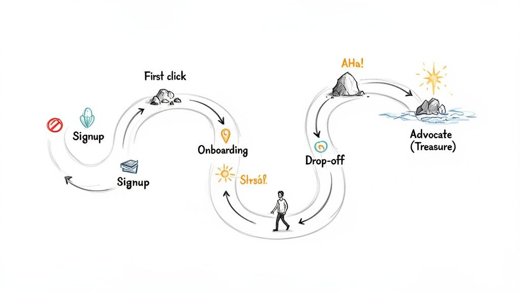
A user journey map is a visual story of every single interaction a customer has with your product or company. Think of it less as a stuffy, corporate diagram and more as a hand-drawn map to buried treasure. It shows the entire path, from the moment a user first hears about you to when they become a loyal fan.
Why a User Journey Map Is Your SaaS Growth Compass
So many bootstrapped founders write off journey mapping as some enterprise-level luxury—something reserved for teams with huge budgets and dedicated researchers. That’s a massive mistake. A user journey map isn’t an abstract, arts-and-crafts exercise; it’s a practical growth tool that forces you to see your SaaS through your customers’ eyes.
Instead of just guessing, a journey map makes you confront the messy reality of what users actually experience. It answers the crucial questions that your analytics dashboards simply can’t.
See Your Product Through Your User’s Eyes
At its heart, a user journey map flips your perspective from your business goals to your customer’s experience. It charts the thoughts, feelings, and actions of a specific user as they try to get something done with your product. This forces you to empathise with their struggles and celebrate their small wins.
For example, your analytics might show a 40% drop-off right after the signup page. A traditional funnel view just calls this a “leak.” A user journey map, on the other hand, digs into the why. It might reveal that users are getting totally overwhelmed by a complex UI or confused by unclear instructions, leading to frustration and a swift exit.
Pinpoint Critical Moments of Truth
Every SaaS product has those make-or-break moments that decide whether a user sticks around or churns. A well-crafted journey map shines a spotlight on these critical touchpoints with startling clarity. By documenting each interaction, you can identify:
- Friction Points: Where do people get stuck, confused, or just plain annoyed? Is it during project setup? Inviting team members? Figuring out that one key feature?
- “Aha!” Moments: When does the real value of your product finally click for them? Nailing this down lets you guide new users to that moment much faster, which can dramatically improve your activation rates.
- Moments of Delight: Where does your product exceed expectations? These are your golden opportunities to build loyalty and get people talking.
A user journey map challenges your assumptions about when the customer’s journey truly begins and ends, uncovering opportunities for innovation you’d otherwise miss. It pulls you out of guesswork and into an evidence-based strategy.
Uncover Actionable Growth Opportunities
Ultimately, the whole point of creating a user journey map is to drive action. It’s a diagnostic tool that shows you exactly where your product experience is failing and where it’s succeeding. By visualising the journey, you create a shared understanding across your team—whether it’s a team of one or five—of what needs to be fixed or amplified.
This process is fundamental to really understanding what your users need. To go a bit deeper, check out our guide on the Voice of the Customer and see how it complements journey mapping perfectly. These maps give you a clear roadmap to improve trial conversions, boost user activation, and systematically cut down churn by solving real user problems.
The Five Core Stages of the SaaS User Journey
To build a decent journey map, you first need to know the key landmarks your users will pass. Think of it like a road trip: you’ve got the planning, the driving, the arrival, and the exploring. The SaaS user journey is no different—it’s not one single experience but a sequence of stages, each with its own unique goals, emotions, and challenges.
Getting a handle on these stages gives you a powerful framework. It helps you make sense of all your user touchpoints, get inside their heads to understand what they’re feeling, and pinpoint exactly where your product is either helping or failing them.
Here’s a quick breakdown of what a typical SaaS journey looks like, from the user’s perspective and yours.
| Stage | User’s Goal | Potential User Emotion | Your SaaS Goal |
|---|---|---|---|
| Awareness | ”My current way of doing this is a pain. Is there a better way?” | Frustration, Curiosity | Get found. Educate them on their problem and show a solution exists. |
| Consideration | ”Okay, tools exist. Which one is the right fit for me?” | Hopeful, Sceptical, Overwhelmed | Build trust. Clearly show your unique value and prove you can solve their problem. |
| Signup | ”This looks promising. Let’s get in and see if it actually works.” | Excitement, Impatience | Make it frictionless. Get them into the app with zero hassle. |
| Onboarding | ”How do I get this thing to do what I need it to do? Show me the value.” | Eagerness, Confusion, Potential Frustration | Guide them to their first “win” or “aha!” moment as quickly as possible. |
| Advocacy | ”This tool is essential to my workflow. I want to get even more out of it.” | Confident, Loyal, Appreciative | Keep them happy. Nurture the relationship and turn them into fans who spread the word. |
Let’s dig a little deeper into what each of these stages really feels like.
Stage 1: Awareness
This is ground zero. It often starts long before a user even knows your brand exists. At this stage, they don’t have a name for their problem; they just feel a pain point. For a small business owner, it might be the slow-burn frustration of spending half a day every month manually creating invoices.
Their goal is simply to find a solution—any solution. They aren’t comparing features or pricing models yet; they’re just Googling things like “how to make invoices faster” or asking for recommendations in a Slack community. Your goal is to meet them right there, with genuinely helpful content that doesn’t just sell, but educates them about their problem and subtly introduces your tool as the answer.
Stage 2: Consideration
Once a potential user can put a name to their problem, they land in the Consideration stage. Now they know solutions like yours are out there, and their focus shifts from finding an answer to finding the best answer for them.
This is where the real comparison shopping begins. They’ll be bouncing between your website and a few competitors, reading reviews, and trying to figure out who to trust. They’re feeling a mix of hope and healthy scepticism—hopeful that your tool will solve their pain, but wary of making the wrong choice and wasting time or money.
Your job here is to build trust and clearly demonstrate your unique value. This is the moment for:
- No-nonsense Feature Pages: Show what your product does and, just as importantly, who it’s for.
- Transparent Pricing: No one likes surprises. Be upfront and build trust from the get-go.
- Real Social Proof: Let your existing customers do the talking through testimonials and case studies that prove you deliver on your promises.
Stage 3: Signup
The Signup stage is a huge moment. The user has done their homework and decided your product is worth a shot. Their only goal now is to get into the app as quickly and painlessly as possible to see if it lives up to the hype.
This is a point of high intent, but also high risk. Any friction—a ridiculously long form, a confusing verification email, or an unexpected credit card request for a “free” trial—can make them bounce instantly. In fact, just simplifying your signup forms can give your conversions a serious boost.
A user’s first impression is often cemented during signup and onboarding. Make this first interaction seamless and valuable, and you’ll slash early churn and set the foundation for a brilliant long-term relationship.
Stage 4: Onboarding
Alright, they’re in. This is arguably the most critical stage for any SaaS product. Your new user is inside your app, and their goal is to get their first “win” as fast as humanly possible. This is the famous “aha!” moment—that instant where they experience your product’s core value firsthand.
For our invoicing app example, that “aha!” moment might be when they create and send their first professional-looking invoice in under two minutes. The emotions here can swing from curiosity to outright frustration if they get stuck. A smooth onboarding experience guides them from curiosity to confidence. Your goal is to lead them straight to that “aha!” moment without drowning them in pop-ups and tutorials.
Stage 5: Advocacy
The final stage, Advocacy, is where a happy user evolves into a true fan. Your product is now a non-negotiable part of their workflow, they’ve mastered its features, and they’ve seen real, consistent value. Their goal is no longer just solving their initial problem; it’s about optimising how they use your tool.
These engaged, delighted users are your single greatest marketing asset. They’re the ones who will recommend you to colleagues, leave glowing reviews, and give you the brutally honest feedback you need to build a better product. Your goal is to keep this relationship strong, continue to delight them with improvements, and make it ridiculously easy for them to share their love for your brand.
How to Build Your First User Journey Map Step-by-Step
Creating a user journey map sounds like a massive, resource-draining project, right? Wrong. For a busy founder, the point isn’t to create a perfect, museum-quality artefact. It’s about building a practical, “good enough” map that actually reveals where users are getting stuck and uncovers growth opportunities—fast.
This isn’t about corporate workshops and endless spreadsheets. It’s a lean, step-by-step process designed for small teams and solo founders. We’re going to cut through the complexity and focus on turning abstract user behaviour into real product improvements.
Step 1: Define Your Persona and Goal
First things first: before you even think about mapping, you need to know who you’re mapping for and what they’re trying to achieve. A generic map for “all users” is about as useful as a screen door on a submarine. You have to get specific.
Start by picking one key user persona. If you run a project management SaaS, this might be “Fiona the Freelance Designer.” Next, give her a single, critical goal, like “Completing and invoicing her first client project.”
This tight focus keeps your map grounded in reality. Every touchpoint, thought, and emotion you chart will be tied directly to Fiona and her objective, which makes the insights you pull out of this process far more powerful.
Step 2: Gather Real User Data on a Budget
Assumptions are the mortal enemy of a useful user journey map. You need to base your map on real evidence, but that doesn’t mean you need a multi-million-dollar research budget. You’re probably sitting on a goldmine of data already.
Here are a few lean ways to get your hands on some qualitative insights:
- Dig into Support Tickets: Look for patterns. What are the recurring questions, complaints, or points of confusion? These are flashing red lights signalling friction in your user experience.
- Send Super-Simple Surveys: Use a free tool to send a one-question survey. Ask users what they struggled with during their first week. Quick, easy, and incredibly revealing.
- Watch Session Recordings: Tools can show you exactly where users are clicking, getting stuck, or rage-quitting. It’s like looking over your user’s shoulder as they navigate your app.
These methods give you raw, unfiltered feedback about the real journey—not the ideal one you imagined in your head. To go a bit deeper, learning how to conduct effective customer needs identification can seriously level up your data gathering.
The insights you find are especially critical for your high-value customers. In Southeast Asia’s digital economy, valued at $218 billion in 2023, the top 30% of spenders account for over 70% of all transaction values. A journey map is your best tool for understanding and nurturing these crucial users from day one. You can read more about this in the full e-Conomy SEA 2023 report.
Step 3: Chart Every Touchpoint and Action
Alright, now it’s time to get visual. Grab a whiteboard, a giant sheet of paper, or a free digital tool. Create columns for the key stages of the journey you’ve already identified (like Awareness, Signup, Onboarding, etc.).
For each stage, list every single action your user takes. Don’t skip the small stuff. For our persona, “Fiona the Freelance Designer,” it might look something like this:
- Awareness: Sees a targeted ad on a design blog she reads.
- Consideration: Reads a comparison review and checks out your pricing page.
- Signup: Enters her details for a free trial.
- Onboarding: Clicks through the product tour, creates her first project, and invites a client.
- Activation: Successfully generates her first invoice.
This infographic gives a simple snapshot of that core SaaS journey, moving from initial Awareness to Signup and, hopefully, all the way to Advocacy.
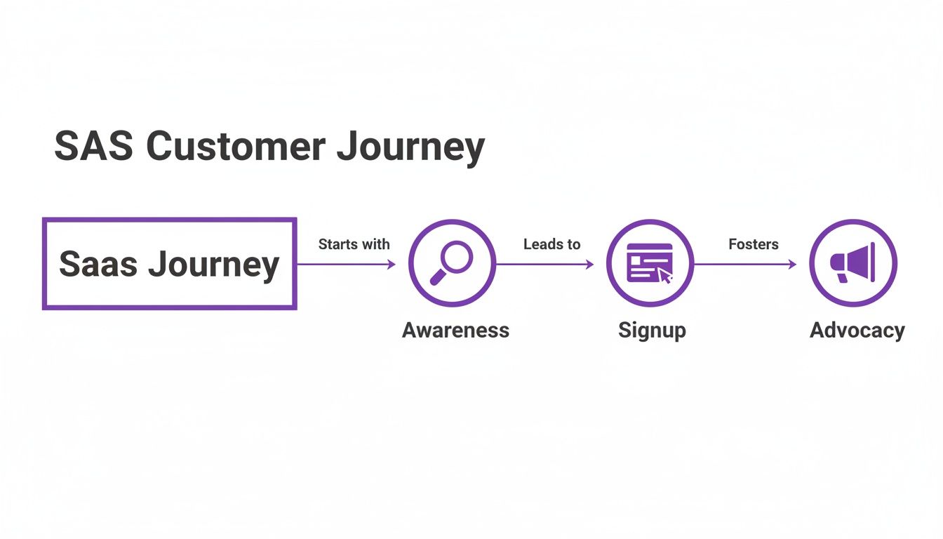
Mapping out these actions creates a clear timeline of the user’s entire interaction with your brand and product, from their very first impression to that first “aha!” moment.
Step 4: Uncover Emotions and Pain Points
This is where the map really comes to life. For every action you just charted, ask yourself: What is the user thinking and feeling at this exact moment?
Go back to your data—the support tickets, survey answers, and session recordings. Use direct quotes and emotional keywords to capture your user’s state of mind.
A great user journey map is built on empathy. It moves beyond tracking clicks and conversions to understand the human experience behind the data—the frustration of a confusing interface or the delight of a feature that ‘just works’.
Let’s see how this might look for Fiona:
- During Signup: Feeling: Hopeful but impatient. Thinking: “I hope this is quick, I have a deadline.”
- Inviting a Client: Feeling: Anxious and confused. Thinking: “Will my client get this? What if I mess it up?”
- Generating an Invoice: Feeling: Relieved and accomplished. Thinking: “Wow, that was easier than I thought!”
This final layer is what exposes the hidden friction points and moments of delight that your analytics dashboards will never show you. It’s these emotional insights that turn your map from a simple flowchart into a powerful tool for building a better product.
Common Journey Mapping Mistakes Founders Should Avoid
So, you’ve decided to build a user journey map. That’s a massive step towards actually understanding your customers, not just guessing what they want. But here’s the thing: like any powerful tool, it’s surprisingly easy to get it wrong.
Far too many founders create beautiful, intricate maps that end up gathering digital dust in a forgotten folder. They look impressive but fail to spark any real change. The good news? Most of these failures come down to a few classic, totally avoidable mistakes. Get wise to these pitfalls now, and your map will become a genuine roadmap for growth.
Mistake 1: Mapping the Perfect Journey That Only Exists in Your Head
This is the big one. It’s so tempting to map the journey you want users to take—that clean, logical path from A to B you designed. But reality is messy. Your users get lost, click the wrong things, get distracted, and feel totally confused at times.
Mapping that “ideal path” is like drawing a map of a city with no traffic, no wrong turns, and no construction. It’s useless for navigation because it ignores all the real-world friction. The true value of a journey map comes from embracing the chaos and charting the bumpy, winding road your users actually travel.
How to fix it: Ditch the fantasy and ground your map in reality. Dive into session recordings, read through support tickets, and talk to your users. Your goal isn’t a neat flowchart; it’s an honest chronicle of the real customer experience, warts and all.
Mistake 2: Relying on Assumptions Instead of Cold, Hard Data
This mistake is best friends with the first one. When you don’t have real data, you’re forced to guess. You assume what users are thinking, you guess what frustrates them, and you invent their motivations out of thin air.
An approach like that turns your journey map into a work of fiction. Sure, your founder’s intuition is sharp, but it’s no substitute for hearing it straight from the horse’s mouth. Without data, you risk pouring resources into solving problems that don’t exist while the real issues—the ones causing people to churn—go completely unnoticed.
A user journey map built on assumptions is just a visual representation of your own biases. A map built on real user data is a roadmap for growth.
Remember, your user base isn’t a monolith. For instance, digital inclusion has tripled connectivity in Southeast Asia since 2015, yet a gap persists for consumers outside major cities. If you don’t map their unique journeys, you’re ignoring massive growth opportunities in economies where e-commerce is projected to double by 2030. Learn more about the e-conomy in Southeast Asia.
Mistake 3: Creating a “One-and-Done” Document
This is probably the most common way journey maps die a slow death. You run a great workshop, create a stunning diagram, present it to the team with a flourish, and then… crickets. It gets saved, filed away, and is never seen again.
Think about it: your product is always changing, and so are your users. A map you made six months ago might as well be an ancient relic. A static map is just a snapshot in time, but the customer journey is a living, breathing thing that evolves daily.
To keep your map from becoming a museum piece, you need to treat it as a dynamic guide. Here’s how:
- Schedule regular check-ins: Revisit your map every quarter or after any major product update.
- Give it an owner: Assign someone on the team to be the official keeper of the map, responsible for keeping it current.
- Make it part of the process: Pull it out when planning new features, brainstorming marketing campaigns, or refining your onboarding flow.
When you treat your journey map as a living document, it stops being a forgotten artefact and becomes what it was always meant to be: a central pillar of your product strategy.
Putting Your User Journey Map into Action with HappyPanda
Let’s be honest, a user journey map is a fantastic diagnostic tool. It shows you exactly where the bumps, cracks, and potholes are in your customer’s experience. But its real value isn’t in just finding the problems—it’s in fixing them. Creating the map is only half the job. The other, far more important half is turning those insights into automated actions that actually improve your product and drive growth.
A static map gathering dust on a digital whiteboard helps you see what’s wrong. An active system, on the other hand, helps you solve it.
This is where a unified customer communication platform like HappyPanda comes in. Think of it as the bridge between the “what” you discovered in your map and the “how” of fixing it, without you having to manually jump in at every single friction point. Instead of just identifying a problem, you can build an automated, repeatable solution for it.
From Pain Points to Automated Solutions
Okay, let’s get practical. Your user journey map is now a goldmine of opportunities. For every point of friction or moment of delight you’ve pinpointed, there’s an action you can take. With an integrated platform, you can connect these dots seamlessly.
Consider a classic scenario your map might uncover: users are successfully signing up for your trial but vanishing within 48 hours. They’re lost, confused, and never quite reach that critical “aha!” moment.
Instead of just knowing this, you can act on it with precision:
- The Insight: Your map shows a steep emotional dip during the initial project setup. Users feel overwhelmed.
- The Manual Fix: You could try to email every new user personally, offering help. This is incredibly time-consuming and simply doesn’t scale, even for a small team.
- The HappyPanda Fix: You create an automated in-app onboarding checklist that triggers the moment a user signs up. It guides them through the exact three steps they need to take to get value, turning confusion into a feeling of accomplishment. Learn more about how to set up effective SaaS onboarding with HappyPanda.
This targeted approach transforms a critical friction point into a structured, supportive experience, giving your user activation rate a serious boost.
Automating the Moments That Matter Most
Your user journey map doesn’t just show you the bad stuff; it also highlights where things go brilliantly right. These moments of delight are your best opportunities to build loyalty and create advocates for your brand. But you have to act on them while the good vibes are still fresh.
Automation is your key to capturing this positive momentum at scale. You can set up triggers based on user behaviour that automatically engage customers at their happiest moments.
Here’s a quick look at how you could build an automation workflow in HappyPanda that connects a user action to a specific communication.
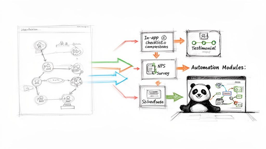
This visual shows how a user’s positive experience can kick off an automated sequence to collect valuable social proof, turning a happy user into a powerful marketing asset.
For example, your map might reveal that users feel a huge sense of relief after successfully sending their first invoice using your software. That’s a peak positive moment right there.
You can configure an automation rule: “If a user completes the ‘Send First Invoice’ action, wait 24 hours, then send them a targeted Net Promoter Score (NPS) survey.”
If they respond with a high score (say, a 9 or 10), another rule can trigger automatically: “If NPS score is 9 or higher, send a follow-up email asking for a testimonial.” This simple, automated sequence turns a moment of delight into powerful social proof for your marketing site, all without you lifting a finger.
Building a Living, Breathing Journey Engine
The demand for tools that can intelligently manage these interactions is growing fast. The customer journey analytics market in the wider Asia-Pacific region is set to explode from USD 2.89 billion in 2024 to a projected USD 13.73 billion by 2032, driven by sectors in Southeast Asia that need to deliver seamless experiences.
This trend highlights a crucial point: mapping the journey is no longer enough. Businesses now need to actively shape and improve it in real-time.
By connecting your user journey map to an automation platform like HappyPanda, you transform it from a static document into a dynamic growth engine. It becomes a system that continuously learns and adapts. When you see a new friction point emerge, you don’t just update the map—you build a new automated workflow to address it. This creates a powerful cycle of insight and action, allowing you to systematically refine the user experience and build a product that customers genuinely love.
Your User Journey Mapping Questions, Answered
Alright, even with the best guide, taking that first leap into journey mapping can feel a bit daunting. I get it. Founders often ask me about the real-world commitment, how it plays nice with their sales funnel, or if it’s even possible without a dedicated budget.
Let’s tackle those common questions head-on. No fluff, just straight answers to give you the confidence to get this done right.
How Often Should I Update My User Journey Map?
Think of your journey map as a living, breathing guide, not a one-and-done project you frame and hang on the wall. The customer experience is always in flux, and your map needs to keep up if you want it to be genuinely useful.
As a rule of thumb, a formal review and update once per quarter is a great rhythm. It keeps the map fresh and relevant.
But that’s just the baseline. You should absolutely pull it out and dust it off anytime you make a significant change to your product or business. For instance:
- You’ve just launched a major new feature or completely redesigned a core part of the UI.
- You’re rolling out a new pricing structure or adding different subscription tiers.
- You spot a sudden, weird shift in key metrics—like a drop in trial-to-paid conversions or a spike in support tickets about one specific thing.
Treating your map as an evolving tool ensures it always shows you what your customers are actually experiencing today, not what they were doing six months ago.
What’s the Difference Between a User Journey Map and a Sales Funnel?
This is a big one, and it trips a lot of people up. They might look similar on the surface, but they’re looking at the same process from two completely different angles.
A sales funnel is built from the company’s perspective. It’s a linear model designed to do one thing: track and optimise the process of turning a lead into a paying customer. It speaks the language of business metrics—MQLs, SQLs, conversion rates. The question it answers is, “How are we doing at pushing people from one stage to the next?”
A sales funnel tracks the ‘what’ and ‘how many’ of conversions. A user journey map uncovers the ‘why’ behind user behaviour, revealing the crucial emotional context that data alone can’t provide.
On the other hand, a user journey map is built entirely from the customer’s point of view. It’s their story—often messy and non-linear—charting their thoughts, feelings, actions, and frustrations across every single touchpoint. It’s all about empathy. It answers the question, “How are they feeling as they try to solve their problem with our product?”
A funnel might show you where users drop off, but a journey map tells you why they leave. It exposes the friction and frustration your analytics dashboard will never see.
Can I Create a Journey Map with No Budget?
Absolutely. The idea that you need a fancy suite of tools or a dedicated research team to build a solid user journey map is a total myth. As a founder, your most valuable assets are your time and your willingness to actually listen to your users.
You can create a powerful, insightful map for free. It’s more about being resourceful than having a big budget.
Here’s your simple, no-cost toolkit:
- Visual Mapping: Use the generous free tiers of tools like Miro or FigJam to lay it all out. Heck, even a spreadsheet will do the job.
- Qualitative Data: Go treasure hunting for user insights. Read through support emails, check social media comments, and hop on a few informal video calls with real users.
- Quantitative Data: Use free analytics and session recording tools to see where people are clicking, getting stuck, and giving up.
The quality of your map isn’t determined by how much money you throw at it. It’s determined by how deeply it’s rooted in genuine user empathy and real-world data.
A user journey map shows you exactly where to improve communication, and HappyPanda gives you the tools to automate it. Turn insights into action with automated onboarding checklists, targeted feedback surveys, and email sequences that guide users through every stage. Start your free trial at https://happypanda.ai.