
Think of Key Performance Indicators (KPIs) as the vital signs for your business. They’re not just random data points; they’re the critical metrics that tell you whether you’re actually hitting your most important goals.
Understanding KPIs Beyond Just Numbers

As a bootstrapped founder, it’s ridiculously easy to drown in data. You’ve got analytics coming from your website, your payment processor, your email platform… the list goes on. But which numbers truly matter? This is where knowing your KPIs becomes a superpower.
Imagine your SaaS is a car on a long road trip. Your KPIs are the gauges on the dashboard. They don’t show you every single mechanical detail, but they give you the essential information you need to reach your destination safely and efficiently.
Your Business Dashboard Analogy
Let’s take this analogy a bit further to see how specific KPIs work just like the gauges in your car:
- Speedometer (Growth): This tracks how fast you’re going and whether you’re accelerating. In business, this could be your Monthly Recurring Revenue (MRR) growth rate or new user sign-ups. It tells you how fast you’re moving forward.
- Fuel Gauge (Cash Flow): This shows how much fuel you have left in the tank. For a bootstrapper, this is your cash runway—your single most critical resource. It tells you how much longer you can keep driving before you need to refuel.
- Engine Light (Churn): This is your early warning system. When it flashes, something is wrong under the hood. Your customer churn rate is the perfect example; a sudden spike is a massive red flag signaling a problem that needs immediate attention before you break down.
The whole point isn’t to track every metric under the sun. It’s about focusing on the handful of indicators that tell you if you’re heading in the right direction, moving fast enough, and have the resources to finish the journey.
Moving From Vanity to Actionable Insights
One of the biggest traps for founders is obsessing over “vanity metrics.” These are the numbers that look impressive on the surface but don’t actually move the needle for the business. Think social media likes, total page views, or app downloads. They might feel good, but they don’t directly impact your bottom line.
True Key Performance Indicators are different. They are actionable. A well-chosen KPI doesn’t just report a number; it forces you to ask a question and guides your next move. If your user activation rate is low, you know you need to fix your onboarding process.
This shift in mindset is crucial, especially for lean teams. With limited time and money, every decision has to be informed and impactful. By zeroing in on actionable KPIs, you can make smarter, faster decisions that directly improve your product, marketing, and retention. It’s the foundation for building sustainable, efficient growth.
How to Choose KPIs That Actually Drive Growth
So, you need to pick your Key Performance Indicators. It can feel like you’re staring at a restaurant menu the size of a novel. With a dizzying number of metrics to choose from, it’s easy to fall into the classic trap of measuring everything. And when you measure everything, you usually end up understanding nothing.
The secret isn’t to drown yourself in more data. It’s about tracking the right data—the numbers that are directly wired to what you’re trying to achieve as a business.
This whole process starts by cutting through the noise and focusing on a single, unifying goal. You need to find your guiding light in a vast sea of metrics.
Find Your North Star Metric
A North Star Metric (NSM) is the one number that best captures the core value your product delivers to customers. Think of it as your company’s one-line mission statement, but in metric form. It’s a single figure that gets the entire team rowing in the same direction.
For a collaboration tool, the NSM might be “number of messages sent,” because that one action perfectly reflects active, valuable use. For a design tool, it could be “projects exported.”
Nailing down your NSM forces you to answer a critical question: what is the absolute fundamental value people get from our product? Once you’ve got it, every decision you make and every KPI you track should be in service of moving that number up and to the right.
Differentiate Leading from Lagging Indicators
Not all metrics are created equal. They generally fall into two camps, and knowing the difference is like navigating a road trip using both a map of the road ahead and a rearview mirror.
-
Leading Indicators: These are the fortune-tellers of your metrics. They’re predictive numbers that give you a glimpse into future success by measuring activities that lead to results. For a SaaS business, a high user activation rate is a classic leading indicator; it strongly suggests future revenue and happy, retained customers.
-
Lagging Indicators: These are the historians. They report on past results and are usually easier to measure but much harder to influence directly. Quarterly revenue or customer churn are perfect examples. They tell you how you did, but they don’t give you much advice on what to do next.
A healthy KPI dashboard has a bit of both. Leading indicators are the levers you can pull today to change tomorrow’s outcome, while lagging indicators confirm whether your grand plans are actually working. It’s also worth your time to understand the difference between Share of Market and Share of Voice, as they offer different but equally valuable perspectives on your company’s performance.
The most effective founders I know are obsessed with their leading indicators. They understand that by improving the inputs (like a slicker user onboarding), they can reliably shape the outputs (like lower churn).
Evolve Your KPIs with Your Business Stage
The KPIs you obsess over today might be irrelevant a year from now. The metrics that are make-or-break for a pre-launch startup are worlds away from those for a company scaling to its first 1,000 customers. Your focus has to shift along with your strategic priorities.
The SaaS Growth Stages & KPI Focus:
-
Launch Stage (Pre-Product/Market Fit): Right now, your entire world is about validation. Do people actually want this thing? Your KPIs should centre on engagement and activation. Are people using the core features? Is the product delivering on its promise? You should be living and breathing metrics like activation rate and soaking up every drop of qualitative feedback.
-
Growth Stage (Scaling): You’ve found your groove with product-market fit. Now, it’s time to pour some fuel on the fire. The game shifts to acquisition and revenue. This is when KPIs like Monthly Recurring Revenue (MRR), Customer Acquisition Cost (CAC), and trial-to-paid conversion rates become your new best friends.
-
Maturity Stage (Optimisation): At this point, you’re established. The focus turns to efficiency and keeping the customers you’ve worked so hard to win. You’ll be optimising the customer experience and maximising value, with KPIs like Customer Lifetime Value (LTV), Net Promoter Score (NPS), and churn rate taking centre stage. And if you really want to get into the weeds, we have a detailed guide on the relationship between CSAT and NPS.
By periodically reviewing and adjusting your KPIs based on your company’s stage, you keep your team focused on what truly matters right now. This kind of disciplined approach turns your dashboard from a simple report into a powerful steering wheel for your business.
The 6 Essential KPIs Every Bootstrapper Must Track
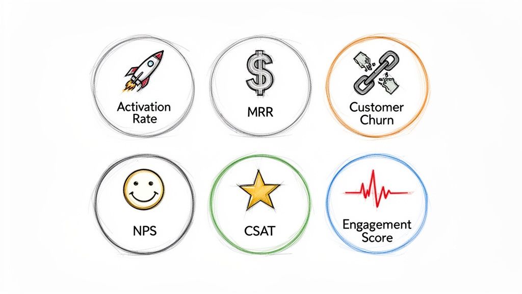
Alright, you understand the why behind KPIs. Now, let’s get our hands dirty and build your dashboard. For a lean, bootstrapped SaaS, you don’t need to track every metric under the sun. That’s a recipe for analysis paralysis.
Instead, you need a handful of numbers that give you a brutally honest look at your business health, from the first click to a happy, paying customer. These six KPIs are your starting lineup. They cut through the noise and give you actionable insights without needing a data science degree to understand them.
1. Activation Rate
Let’s start with arguably the most critical early-stage metric: Activation Rate. This isn’t just about sign-ups; it’s about the “aha!” moment. It’s the percentage of new users who actually experience your product’s core value for the first time.
What counts as “activation”? That’s up to you. For an email tool, it might be sending the first campaign. For a project management app, creating the first task. It’s the point where a user truly gets what you’re offering.
Formula: (Users Who Hit Your Activation Milestone / Total New Sign-ups) x 100
A low activation rate is a massive red flag. It screams that your onboarding is confusing, your value prop is unclear, or both. Fixing this is your single biggest lever for improving everything that comes after, from retention to revenue.
2. Monthly Recurring Revenue (MRR)
Monthly Recurring Revenue (MRR) is the heartbeat of any subscription business. It’s the predictable, reliable income you expect to bring in every single month. Forget the rollercoaster of one-off sales; MRR gives you the stability to plan, forecast, and sleep at night.
But don’t just look at the total number. The real story is in the moving parts:
- New MRR: The fresh cash from brand-new customers.
- Expansion MRR: Extra revenue from existing customers upgrading or adding services. This is gold.
- Churn MRR: The revenue you lose when customers cancel or downgrade. The enemy.
For bootstrappers, knowing where you stand is crucial. It’s worth checking out industry benchmarks for MRR growth rates to get a sense of the field. A healthy SaaS is always working to grow Expansion MRR faster than Churn MRR eats away at it.
3. Customer Churn Rate
Customer Churn is the silent killer of SaaS dreams. It’s the percentage of customers who pack their bags and leave each month. A seemingly small 5% monthly churn sounds manageable, right? Wrong. That’s 50% of your customers gone within a year.
That puts you on a treadmill, constantly scrambling for new customers just to stand still. It’s exhausting and expensive.
Formula: (Customers Who Cancelled in a Period / Total Customers at Start of Period) x 100
Keeping churn low isn’t about flashy tricks; it’s about consistently delivering value and a fantastic customer experience. It’s always cheaper to keep a customer than to find a new one. Always.
4. Net Promoter Score (NPS)
Time to measure vibes. Net Promoter Score (NPS) gauges customer loyalty by asking one simple, powerful question: “On a scale of 0-10, how likely are you to recommend us to a friend?”
Based on the answer, your users fall into three camps:
- Promoters (9-10): Your biggest fans. They’ll shout your name from the rooftops.
- Passives (7-8): They’re satisfied, but not thrilled. They could easily be swayed by a competitor.
- Detractors (0-6): Unhappy campers who might actively tell people to avoid you.
NPS is a peek into your future growth. A high score means you’ve built genuine relationships and have an army of promoters driving word-of-mouth. A low score is a smoke signal telling you there’s a fire you need to put out, fast.
5. Customer Satisfaction (CSAT)
While NPS gives you the big picture on loyalty, Customer Satisfaction (CSAT) is your real-time snapshot. It zooms in on a specific interaction, usually asking, “How would you rate your satisfaction with [the support you just received/this new feature]?” on a simple scale.
CSAT is brilliant for finding friction points. You can trigger a survey right after a support ticket is closed or after a user tries a new feature. The feedback is immediate, specific, and incredibly useful for figuring out what’s working and what’s driving people crazy.
6. Engagement Score
Finally, we have the Engagement Score. This isn’t a one-size-fits-all metric; it’s a custom cocktail you mix yourself. The goal is to measure how actively users are interacting with your product in meaningful ways.
You assign points to key actions that you know correlate with long-term retention—things like logging in daily, using a core feature, inviting a teammate, or exporting a report.
A simple Engagement Score could weigh factors like:
- Weekly logins
- Number of core features used
- Time spent in-app per session
This score turns abstract usage data into a single, actionable number. It helps you spot at-risk users who are drifting away and identify your super-users—the perfect people to ask for a glowing testimonial.
Essential KPIs for Bootstrapped SaaS
To pull it all together, here’s a quick-reference table summarizing the core metrics every bootstrapped founder should have on their radar.
| KPI (Key Performance Indicator) | What It Measures | Why It Matters for Bootstrappers |
|---|---|---|
| Activation Rate | The percentage of new users who experience the “aha!” moment. | Tells you if your onboarding works and if your value is clear. |
| Monthly Recurring Revenue (MRR) | Your predictable monthly subscription revenue. | The financial heartbeat of your SaaS; crucial for forecasting and stability. |
| Customer Churn Rate | The rate at which customers cancel their subscriptions. | High churn silently drains your growth and makes progress impossible. |
| Net Promoter Score (NPS) | Customer loyalty and willingness to recommend your product. | A leading indicator of word-of-mouth growth and brand health. |
| Customer Satisfaction (CSAT) | Short-term happiness with a specific interaction or feature. | Pinpoints immediate friction and helps improve the user experience. |
| Engagement Score | A custom metric showing how actively users interact with your product. | Proactively identifies at-risk users and power users. |
These six KPIs provide a solid foundation. They give you a 360-degree view of your business, from acquisition and revenue to satisfaction and retention, without drowning you in data.
Building Your First KPI Dashboard Without Breaking the Bank
Making the leap from knowing what your KPIs are to actually using them can feel like a big one. A lot of founders think they need some ridiculously expensive, complicated business intelligence software to build a useful dashboard.
The good news? You don’t. You can whip up a powerful, insightful dashboard on a shoestring budget, probably using tools you’re already paying for.
The goal here isn’t to create something flashy enough for a board meeting presentation. It’s to build your own single source of truth. This is the one place you can glance at every morning with your coffee to get an honest, immediate read on the health of your business. It’s about turning a bunch of abstract numbers into a clear, visual story.
Designing Your Lean Dashboard
Start simple. Think of a basic grid layout, maybe in a spreadsheet or a simple dashboard tool. Give each of the six essential KPIs we’ve covered its own dedicated spot, front and centre.
For each metric, you’ll want to display three key things:
- The Current Number: The live value of the KPI. For instance, your current MRR is £8,500.
- The Trend: A little sparkline graph or an arrow showing how it’s performed over the last 30 days. Is it heading up, down, or staying flat?
- The Target: The goal you’ve set for that metric this month or quarter.
This simple structure immediately gives you context. Seeing an MRR of £8,500 is one thing. Seeing that it’s up 15% from last month and this close to your £10,000 goal tells a much richer, more useful story.
Using Thresholds to Spot Trouble Instantly
The most effective dashboards use colour-coding to make performance obvious at a glance. It’s a simple visual trick that saves you from having to squint at raw numbers every time you check in. Think of it as a traffic light system for your business.
Set up three straightforward rules for each of your key performance indicators:
- Green (On Track): The metric is hitting or exceeding your target. Everything’s looking good.
- Yellow (At Risk): It’s slipping a bit but is still within a recoverable range. This is your cue to pay closer attention.
- Red (Problem): The metric is way off target and needs you to drop what you’re doing and investigate. Now.
So, if your target monthly churn rate is 3%, you might set it up so that anything below 3% is green. Maybe 3-4.5% is yellow, and anything over 4.5% flashes a big, angry red. This visual system lets you spot problems in seconds, not hours.
The Agony of a Fragmented Data World
And here’s where most bootstrappers hit a wall. Your MRR and churn numbers are sitting in your payment processor. Your NPS and CSAT scores are locked away in your survey tool. Your engagement metrics are in yet another product analytics platform.
Juggling all these separate sources is more than just annoying—it creates dangerous blind spots.
When your data is scattered all over the place, you can’t see how things connect. You have no idea if that dip in NPS scores last month is the direct cause of the churn spike you’re seeing this month. Trying to piece that puzzle together manually is a tedious, error-prone nightmare, which is precisely why a single source of truth is so critical. If you’re struggling with this, you can read our guide on how to build a single source of truth for your business.
This is exactly why unified platforms are so valuable. When all your key performance indicators live in one place, the relationships between them become crystal clear. You can start drawing direct lines from customer feedback to revenue, turning your dashboard from a simple report into a strategic command centre. For instance, just as Southeast Asia’s capital markets use IPO activity as a KPI for economic momentum, your dashboard should connect user satisfaction to financial health. You can find more insights about how capital markets use KPIs on aseanexchanges.org.
Turning KPI Insights Into Automated Action
A dashboard filled with glowing green numbers feels fantastic, doesn’t it? But let’s be honest, data is useless without action. Staring at your key performance indicators isn’t the same as actually improving them. This is where we bridge that critical gap between tracking metrics and driving real, tangible growth.
The secret is to make your KPIs work for you, 24/7. Imagine a system where your metrics aren’t just passive reports but active triggers for immediate, relevant communication. That’s the power of KPI-driven automation, a method that lets even a solo founder create sophisticated, responsive user experiences that scale.
This simple flow shows how raw data evolves into meaningful business action, highlighting that crucial final step so many founders miss.
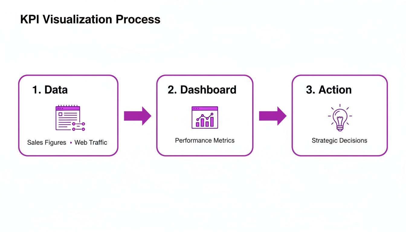
As the diagram shows, turning data into a pretty dashboard is only half the journey. The real value is unlocked when those insights trigger intelligent actions.
From Manual Reaction to Proactive Automation
As a bootstrapper, your time is your most precious asset. You can’t afford to manually check your CSAT scores every hour, spot an unhappy user, then draft a personal email to see what went wrong. By the time you do all that, their frustration has probably settled in for good.
Automation flips this script from reactive to proactive. Instead of you chasing down problems, your systems respond instantly based on the data your users provide. This transforms customer communication from a series of manual chores into a smart, self-operating engine.
Here’s what this looks like in practice with a few simple, powerful workflows:
- The Unhappy User: A customer submits a low CSAT score of 2/5. An automation instantly triggers a personalised email from you, asking for more detail about their experience. Simple, effective, and immediate.
- The Raving Fan: A user gives you a glowing NPS score of 10. The system waits 24 hours, then automatically sends a friendly request for a testimonial or a review. Perfect timing.
- The Disengaged Trial: A user’s engagement score drops below a set threshold for three straight days. An automated email is sent with a helpful tip or a link to a case study, re-engaging them before the trial expires.
These aren’t complex, enterprise-level setups. With a unified tool like HappyPanda, you can build these kinds of workflows in minutes, connecting your feedback collection directly to your email sequences.
Scaling Personalisation Without Losing Your Mind
The real beauty of connecting your key performance indicators to automated workflows is that you can scale personalised communication. You can deliver the right message to the right person at exactly the right moment, all without lifting a finger.
A low CSAT score is a gift. It’s a user telling you exactly where your product or service is falling short. Automating your response ensures you acknowledge that gift immediately, turning a potentially negative experience into an opportunity to show you care.
This level of responsiveness builds immense customer loyalty. Users feel heard and valued because their feedback generates an immediate, relevant reaction. It’s the kind of high-touch experience that was once only possible for companies with large support teams. Now, it’s accessible to everyone. To explore this concept further, check out our guide on how to automate business processes to save time and strengthen customer relationships.
Integrating Broader Business Trends
As your business grows, you can even start integrating wider trends into your KPI strategy. For example, ESG (Environmental, Social, and Governance) Key Performance Indicators are becoming increasingly important for businesses in regions like Southeast Asia. For a bootstrapped founder, this doesn’t mean you need a complex sustainability report.
Instead, you can cleverly map your existing customer comms KPIs to these concepts. A high Net Promoter Score can be framed as a measure of your positive ‘social’ impact, while a high completion rate for an onboarding checklist can reflect good ‘governance’ in user education. By using a platform like HappyPanda to automate actions like NPS-triggered testimonial requests, you can easily track and showcase these metrics to differentiate your brand. You can discover more insights about emerging ESG trends on maayancapital.com.
Ultimately, turning insights into action means creating a closed loop. Data flows in, triggers an automated response, and that interaction generates new data. This virtuous cycle is how you stop just measuring your business and start actively improving it, one automated workflow at a time.
A Few Common Questions About KPIs
Jumping into the world of KPIs can feel a bit like learning a new language, but a few core ideas can clear things up fast. This section is your cheat sheet, tackling the questions we hear most often from bootstrapped founders. Think of it as a quick guide to help you steer clear of common traps and build a tracking strategy that actually works.
It’s totally normal to have questions when you start weaving KPIs into your daily rhythm. The goal isn’t just to hoard data; it’s to build a reliable compass that guides your decisions without drowning you in spreadsheets.
How Often Should I Check My KPIs?
The right rhythm for checking your KPIs really depends on what you’re measuring and how fast your business moves. Not every metric needs your eyeballs on it daily—in fact, checking some too often can lead to knee-jerk decisions you’ll regret. A balanced approach is your best bet.
A good way to think about it is to split them into two camps:
- Leading Indicators: Things like user activation rates or daily sign-ups are worth a look daily or weekly. These are your early warning signals. They help you make small, quick adjustments, like tweaking an onboarding flow that isn’t clicking or pulling the plug on a dud ad campaign.
- Lagging Indicators: Your big-picture metrics like MRR, customer churn, and LTV are best reviewed monthly or quarterly. They tell the story of your business’s long-term health. Peeking at them too often is like watching a pot boil—you’ll just stress yourself out over normal, tiny fluctuations.
The real goal is to get into a consistent groove. A dedicated Monday morning dashboard review is way more powerful than random checks throughout the week. Consistency is what lets you spot the trends that matter, and that’s where the gold is.
What Is the Difference Between a Metric and a KPI?
This is a big one, and it trips up a lot of founders. People throw these terms around like they’re the same thing, but they represent totally different levels of importance. Nailing this distinction helps you cut through the noise and focus on what will actually move the needle.
Think of it this way: a metric is just about any number you can track. “Website visitors” is a metric. So is “social media followers.” They’re measurements, but they don’t necessarily tell you if you’re winning or losing.
A KPI (Key Performance Indicator), on the other hand, is a metric you’ve hand-picked because it’s directly tied to a critical business goal. It measures something that truly defines success for you. “Trial-to-paid conversion rate” is a KPI because it’s wired directly into your revenue goals.
So, while all KPIs are metrics, only your most vital, strategy-aligned metrics get to be called KPIs. These are the numbers you’d bet your company on.
Can I Have Too Many KPIs?
Oh, absolutely. And it’s one of the easiest and most damaging mistakes you can make. The temptation to measure everything is strong—you’re scared you’ll miss something important. But this “measure it all” approach almost always backfires.
When you track too many key performance indicators, you end up with “analysis paralysis.” You’re so buried in data that you can’t see straight, let alone make a confident decision. It kills your focus and leaves you guessing which lever to pull to make things happen.
For a bootstrapped SaaS, a tight list of 5-7 core KPIs is plenty. That’s enough to give you a clear, 360-degree view of your business—covering acquisition, revenue, and retention—without all the distracting noise. Remember, the point of KPIs is to bring clarity and drive action, not just to collect numbers for the sake of it.
How Do I Set Realistic Targets for My KPIs?
Setting targets can feel like you’re just pulling numbers out of thin air, but it doesn’t have to. Resist the urge to pluck a goal from a blog post or copy what some industry giant is doing. The most reliable source for setting goals is your own history.
First, just get a baseline. Track your chosen KPIs for at least 30-60 days without any targets at all. This gives you an honest, unfiltered look at where you’re starting from. It’s your ground zero.
From there, aim for small, steady wins. Set goals like, “Let’s increase the user activation rate by 5% next month,” or “Our goal is to reduce customer churn by 0.5% this quarter.” These targets are big enough to matter but small enough to feel achievable, which keeps your team fired up. Your own past performance is the best crystal ball you have.
Ready to stop juggling spreadsheets and start turning your KPIs into automated action? HappyPanda unifies your feedback, emails, onboarding, and analytics into a single, powerful platform built for bootstrapped founders. Get started in minutes and see how easy it can be to grow your SaaS.