
Let’s be honest, the term “call to action” sounds a bit dry, doesn’t it? It’s often reduced to a simple instruction on a webpage: “Start Your Free Trial” or “Download the eBook”. But for a bootstrapped SaaS founder, thinking of a CTA as just a button is a massive missed opportunity.
Why Your Call to Action Is More Than Just a Button
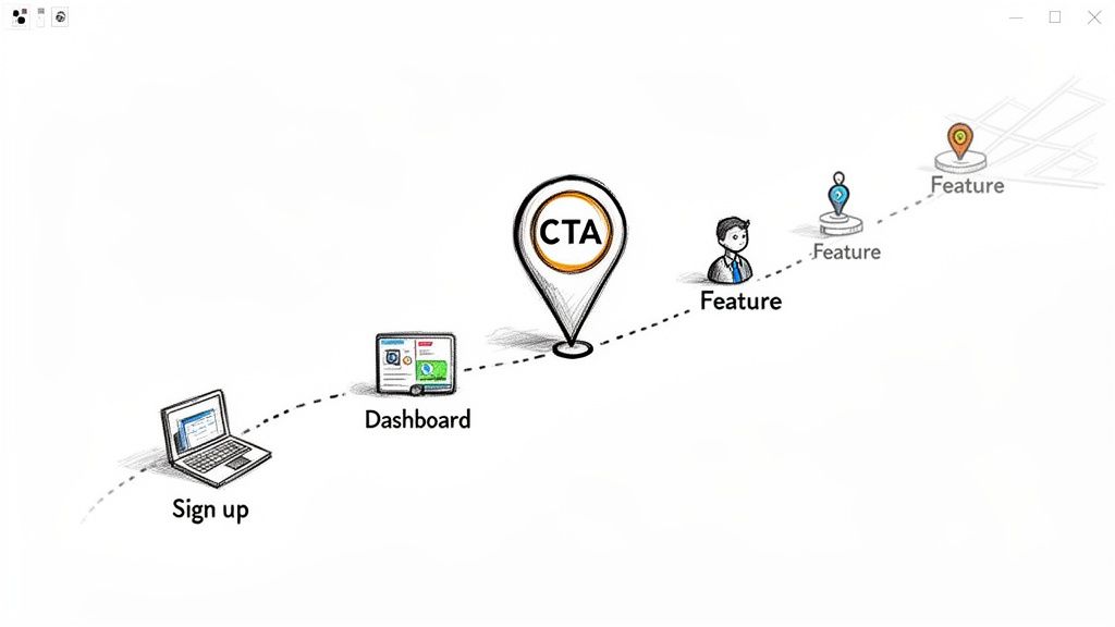
Many founders treat the CTA as a final design touch—something to stick at the bottom of a page. This perspective misses the bigger picture entirely. Your CTA isn’t just a button; it’s the GPS guiding users through your entire product. Without clear directions, even your most brilliant features will gather dust, and the critical actions you need users to take will simply never happen.
This guide isn’t about dictionary definitions. It’s about reframing the CTA as the central nervous system of your user journey. An effective call to action is the bridge between a user’s casual curiosity and their deep engagement with your product. It’s what turns a passive window-shopper into an active, paying customer.
The Foundation of User Guidance
As a bootstrapped founder, your resources are precious. You don’t have a big sales team to hand-hold every new user through the setup process. Your product has to do the heavy lifting, and CTAs are your most powerful tool for the job. They create a logical, intuitive path for users to follow, from the second they sign up to the moment they decide to upgrade.
Great CTAs aren’t just about clever copy; they’re built on solid principles of user experience and psychology. They provide clarity, slash friction, and create a sense of purpose. When you get them right, they have a direct impact on the metrics that matter most:
- Trial-to-Paid Conversions: Guiding users toward that crucial “Upgrade Now” click.
- Feature Adoption: Nudging users to explore and integrate new tools into their workflow.
- Churn Reduction: Reminding users of the value they’re getting and prompting them to re-engage.
For a bootstrapped founder, mastering the art of the call to action is non-negotiable. It is the fundamental difference between a user getting lost and frustrated versus one who confidently navigates from sign-up to becoming a loyal advocate for your product.
From Ambiguity to Action
Imagine a new user lands on their dashboard for the very first time. What are they supposed to do? Set up their profile? Invite a teammate? Create their first project? Without a primary call to action, they’re left in a state of “analysis paralysis.” More often than not, this confusion leads them to close the tab and never come back. After all, an estimated 96% of first-time visitors to a website aren’t ready to buy, making clear guidance even more critical.
Now, picture that same dashboard with a single, compelling CTA: “Create Your First Project in 60 Seconds.” This simple instruction provides immediate focus. It transforms an overwhelming blank slate into a tiny, manageable first step, setting the user on a path to discovering your product’s real value.
That’s the power of a well-crafted CTA.
The Psychology Behind a High-Converting Call to Action
Ever wondered why one button gets all the clicks while another sits there, completely ignored? It’s not just about a flashy colour or clever text. The real magic behind a high-converting call to action is pure human psychology. It’s less of a command and more of a perfectly timed nudge that connects with a user’s motivation, their ability to act, and a specific trigger.

Think of it like starting a car. You need fuel (that’s the motivation), a key that actually fits the ignition (the ability), and the final turn to get the engine running (the trigger). If you’re missing any one of those pieces, you’re not going anywhere. An effective CTA is that final turn of the key—the simple, final step that roars the engine to life.
Tapping into Human Behaviour Models
A brilliant way to frame this is with Fogg’s Behavior Model, which says that for any action to happen, you need three things to line up: Motivation, Ability, and a Prompt. Your CTA is the prompt. Its whole job is to make the desired action feel ridiculously easy at the exact moment a user is most motivated to do it.
For a SaaS founder, this is about aligning your CTAs with what your user is trying to achieve right now.
- High Motivation + Easy Action: When someone is pumped to solve a problem, a CTA like “Start Your Free Trial” is a knockout. It speaks directly to their goal and asks for very little in return.
- Low Motivation + Easy Action: If a user is just kicking the tyres, a lower-stakes CTA like “See a 2-Minute Demo” works much better. It’s a smaller ask, making it easier to say yes to.
The key is to cut down the mental effort. This is why action-packed language like “Get Your Free Report” blows a passive word like “Submit” out of the water. It instantly tells the user what they’re getting for their click, answering that subconscious question: “What’s in it for me?”
A great call to action works because it makes the next step feel like the most logical, beneficial, and simple choice a user can make at that moment. It removes doubt and replaces it with a clear path forward.
Leveraging Scarcity and Urgency
As humans, we’re wired to avoid losing something far more than we are to gain something new. This is a powerful principle called loss aversion, and it’s gold for your CTAs. Instead of just hyping up the benefits, you can frame not acting as a tangible loss.
For instance, at the end of a trial, a CTA that says, “Don’t Lose Your Pro Features,” often hits harder than “Upgrade to Pro.” It triggers that fear of missing out (FOMO) and taps into a powerful psychological motivator. With an estimated 90% of people who read a headline also reading the CTA copy, getting this framing right is a huge deal.
Creating a Need for Completion
Here’s another sneaky bit of psychology for you: the Zeigarnik effect. This is the idea that our brains remember unfinished tasks much better than completed ones. It’s that nagging feeling you get when you leave something half-done.
You can use this to your advantage in onboarding flows. An in-app checklist with a CTA like “Complete Your Profile (1 step left!)” creates a mental itch that users just have to scratch.
This little trick transforms a user from a passive observer into an active participant. Every ticked box delivers a tiny dopamine hit, making them feel good and reinforcing their engagement. It’s the same satisfaction we get from crossing items off a to-do list.
This principle is also incredibly useful for gathering social proof. Once a user has hit a milestone or finished a key task, they’re feeling a sense of accomplishment. That’s the perfect moment to slide in a prompt asking for feedback. You can even automate this with tools that collect testimonials at just the right time, turning happy users into your biggest advocates.
Mapping CTAs Across the SaaS Customer Lifecycle
A brilliant call to action is like a powerful engine, but if you stick it in the wrong vehicle, you’re not going anywhere. The same CTA that absolutely crushes it on your pricing page will fall completely flat inside your application. Strategic placement is everything; it’s about presenting the right prompt, to the right user, at exactly the right moment.
For a bootstrapped founder, the best way to think about this is to see the entire customer lifecycle as a series of conversations. Each stage—from a user’s first click to them becoming a loyal advocate—has its own unique goal. Your CTAs are the nudges that guide these conversations forward, making sure users never have to stop and ask, “Okay, what now?”
The Onboarding and Activation Stage
This is your golden window. A new user has just signed up, their curiosity is at its peak, and they’re itching to see if your product is the real deal. Your one and only job here is to get them to their “Aha!” moment as fast as humanly possible—that magical point where they feel the core value of your tool.
CTAs during this phase need to be super specific, action-oriented, and focused on small, achievable wins. Forget generic prompts like “Get Started.” Think micro-steps.
- CTA Example 1: “Create Your First Project in 60 Seconds”
- CTA Example 2: “Invite One Teammate to Collaborate”
- CTA Example 3: “Connect Your Calendar to See the Magic”
These prompts break down what could be an overwhelming setup process into bite-sized, satisfying tasks. They build momentum and create a sense of accomplishment, which is vital for turning a curious trial user into an activated one. You can get more ideas for these crucial first steps by exploring strategies for improving user onboarding.
The Retention and Engagement Stage
Alright, they’re activated. Now your focus shifts from that initial setup to long-term habit formation. The goal is to keep them coming back, discovering new features, and weaving your product into their daily workflow until they can’t imagine life without it.
CTAs in this stage are less about big, one-time actions and more about subtle, value-driven nudges.
- In-App Feature Discovery: A small tooltip pops up with the CTA, “Automate This Report and Save 10 Mins a Day.”
- Email Re-engagement: An email lands in their inbox after a week of inactivity. The subject: “Your new dashboard is waiting.” The CTA button is clean and clear: “See What’s New.”
A well-placed call to action during the retention stage doesn’t just ask a user to do something; it reminds them why they signed up in the first place by consistently pointing them toward value.
The Expansion and Advocacy Stage
This is where your power users live. They’ve fully integrated your product, they’re getting real results, and they’re prime candidates for upgrading or becoming your biggest fans. CTAs for this segment are designed to capture that positive energy and channel it into tangible growth.
Now is the perfect time to ask for social proof or dangle a premium feature. An automated prompt after a user hits a key milestone—like exporting their 100th report—can work wonders.
- Testimonial Request: “Loving the results? Share your success story in 30 seconds.”
- Upgrade Prompt: “Unlock advanced analytics to get deeper insights. Upgrade to Pro.”
- Referral Ask: “Know someone who’d love this? Invite a friend and you both get a month free.”
By mapping your call to action strategy to these distinct lifecycle stages, you move from just providing a tool to becoming an indispensable partner in their success, guiding them every step of the way.
To make this even clearer, here’s a quick-reference table that breaks down the strategy for each stage of the customer journey.
CTA Strategy by SaaS Customer Lifecycle Stage
| Lifecycle Stage | Primary Goal | Effective Channel | Example Call to Action |
|---|---|---|---|
| Onboarding | Guide users to their “Aha!” moment and drive initial value. | In-app tooltips, welcome emails, onboarding checklists. | ”Import your first dataset now” |
| Activation | Encourage completion of key setup actions. | In-app modals, progress bars, contextual prompts. | ”Connect your account to unlock this feature” |
| Retention | Promote feature discovery and build daily habits. | Email newsletters, in-app notifications, feature announcements. | ”Try our new AI-powered summary” |
| Engagement | Re-engage inactive users and deepen product usage. | Re-engagement emails, targeted in-app messages. | ”See the projects you’ve missed” |
| Expansion | Drive upgrades and increase revenue per user. | Upgrade prompts, pricing page, targeted email offers. | ”Unlock advanced reporting with Pro” |
| Advocacy | Encourage referrals and collect social proof. | In-app surveys, testimonial request emails, referral program pages. | ”Love our tool? Share it and earn rewards” |
Think of this table as your playbook. Instead of guessing, you can be intentional about which CTA to use and when, ensuring every message you send has a purpose and pushes the relationship forward.
Going Global? Your CTAs Need a Local Touch in Southeast Asia
So, you’re thinking about expanding your SaaS into the booming Southeast Asian (SEA) market? Fantastic move. It’s a region buzzing with digital energy and massive growth potential. But here’s the thing: trying to win over this market with a generic, Western-style call to action is like showing up to a party in the wrong outfit. It just won’t land.
Treating the region as one big, happy monolith is the fastest way to get ignored. A CTA strategy that crushes it in North America or Europe will likely fall completely flat. To succeed, you need to get nuanced. We’re talking a localised approach that truly gets the diverse cultural, linguistic, and digital habits across countries like the Philippines, Vietnam, Singapore, and Thailand.
The biggest mistake I see founders make is thinking a simple translation will do the trick. Spoiler alert: it won’t. Real localisation goes way deeper, touching everything from language and timing to the very way you frame your offers. What clicks with a user in Kuala Lumpur might be a total miss for someone in Ho Chi Minh City. Your CTAs have to speak their language—and I don’t just mean literally.
Why Your Short, Punchy CTAs Might Be Failing
In many Western markets, we’re taught that the best CTAs are short, sharp, and to the point. Think “Get Started” or “Buy Now.” But in a lot of SEA markets, especially those that are mobile-first and built on relationships, users often want a bit more context. A slightly longer, more descriptive call to action can feel less demanding and a whole lot more reassuring.
For example, instead of a blunt “Upgrade,” try something like “Upgrade to Unlock All Features.” See the difference? It instantly clarifies the value you’re offering. This is a game-changer for mobile users who don’t want to tap around to find out what they’re getting into. Building trust is everything, and your CTAs are right on the front line of that conversation.
A localised call to action isn’t just about changing the words; it’s about changing the conversation to fit local expectations. It’s the difference between shouting a command and offering a helpful, culturally-aware suggestion.
Getting the Timing and Language Just Right
You have to understand the local digital rhythm. When are people actually online and paying attention? Peak engagement times can swing wildly from one country to the next, and this is especially true for email marketing—a powerhouse channel for nurturing leads in the region.
A quick look at Southeast Asia’s email marketing benchmarks reveals some fascinating habits. In Thailand, for instance, peak email open rates hit much later in the evening, between 5-11 PM, with another little spike from 11 PM to midnight. This makes a time-sensitive CTA like “Claim Your Indie Plan Before Midnight” incredibly effective if you schedule it for a late-night send.
Likewise, in Singapore, Malaysia, and the Philippines, you’ll often find that longer email subject lines that include a compelling CTA actually get higher open rates. You can discover more insights about these regional email marketing benchmarks and see how to weave them into your own strategy.
This is all part of guiding users through their journey with your SaaS, from their first trial to becoming die-hard fans.
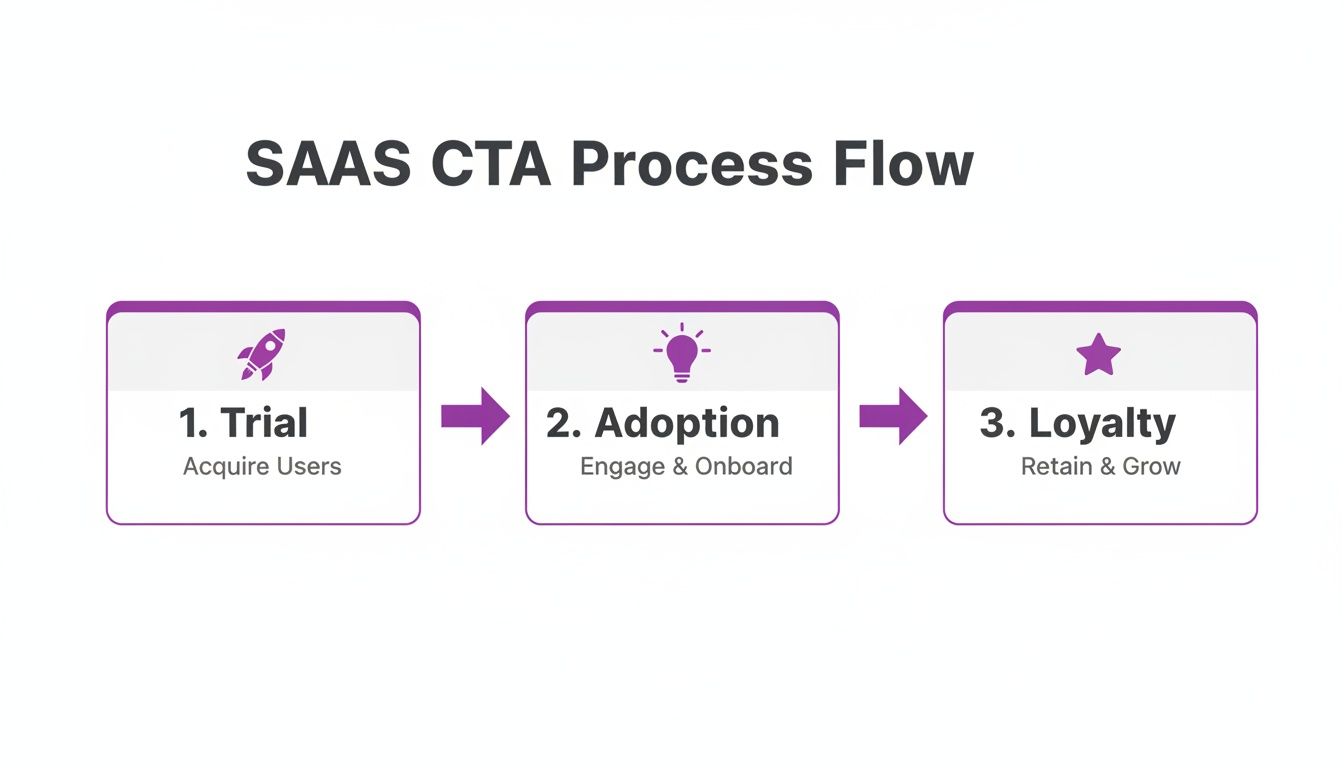
As you can see, each stage—Trial, Adoption, and Loyalty—needs a different kind of CTA to nudge the user forward successfully.
Practical Tips for Nailing Your SEA Localisation
Want to give your SaaS a real edge? You’ve got to move beyond just swapping out a few words. Here are some actionable strategies to make your CTAs truly connect with local audiences.
- Don’t Fear the Word Count: Go ahead, be descriptive. Test out longer CTA copy that spells out the benefit. Instead of a plain “Sign Up,” why not try “Sign Up Free and Get Instant Access”? That small tweak adds a ton of value.
- Show Off Local Social Proof: Nothing builds trust like seeing people like you using a product. Feature testimonials or logos from local businesses. A CTA that says “Join 500+ Businesses in the Philippines” hits a lot harder than a generic “Join Thousands of Businesses.”
- Think Local at Checkout: Your “Upgrade Now” button is useless if it leads to a payment page that only takes credit cards. Make sure you support popular local options like e-wallets (GCash, GrabPay) or bank transfers.
- Respect the Culture: Colours, symbols, and imagery can mean very different things across borders. Do a little homework on cultural associations before you design your buttons. A colour that screams “action!” in one country could have negative vibes in another.
Putting in the time to really understand and adapt to these regional quirks can turn your call to action from a simple button into a powerful engine for growth in one of the most exciting digital markets on the planet.
How Smart CTAs Drive Growth for Lean SaaS Businesses
For a bootstrapped SaaS founder, a smart call-to-action isn’t just a button on a webpage—it’s one of your hardest-working employees. It never sleeps. Without a massive sales team to guide users, your product has to do the heavy lifting, turning curious visitors into loyal advocates. Smart CTAs are the secret sauce that makes that journey happen automatically.
Think of it like this: every single time a user interacts with your product, there’s a chance to build on that relationship. A well-placed CTA is the difference between a user drifting away and a user taking the exact next step you want them to. It’s about having thousands of tiny, personalised conversations, all running on autopilot.
From Manual Grind to Automated Growth
Not too long ago, this level of hyper-personalisation was a luxury reserved for massive companies with even bigger budgets. Today, any indie founder can set up the same powerful strategies using simple automation rules. It’s a complete game-changer, levelling the playing field and letting the smallest teams punch well above their weight.
Just look at these simple-but-powerful automated flows:
- A user gives you a high NPS score? → Boom. An automated CTA pops up asking for a testimonial.
- A user’s trial is about to end? → An email lands in their inbox with a clear nudge: “Upgrade and Keep Your Pro Features.”
- A user successfully uses a new feature for the first time? → A prompt appears: “Share This Report with Your Team.”
These aren’t just clever tricks; they’re automated growth engines humming away in the background. They work tirelessly to boost activation, slash churn, and build social proof—all without you lifting a finger. Of course, getting these prompts right means aligning them with broader content creation best practices to ensure they actually connect with your audience.
For a lean SaaS, every CTA is an employee. It works 24/7 to guide users, collect feedback, and drive revenue. Your job is to give each one a clear and specific task.
Tapping into a Growing Market
This automated approach is especially potent in today’s booming digital economies. Take the Southeast Asia CRM market, for example. It’s on track to hit USD 2.56 billion by 2030, and small to medium-sized businesses (SMEs) are gobbling up a massive 42.31% of that pie. For a modern platform, a simple automation rule like “If NPS >=9, Request Testimonial” can take a complex process that used to take weeks and boil it down to 10 minutes of setup. That’s a massive advantage for founders on a budget.
This isn’t just theory; it’s a practical roadmap to sustainable growth. By automating these key interactions, you free up your most precious resource—your own time—to focus on what really matters: building an incredible product. A solid CTA strategy directly fattens your bottom line by creating a more engaged, more valuable user base. It’s also one of your best weapons against user drop-off, a topic we dive deep into in our guide to understanding and reducing churn in SaaS. When you connect smart prompts to real user behaviour, you create a powerful, self-reinforcing loop of engagement and growth.
A Simple Framework for A/B Testing Your Calls to Action
Stop guessing what works and start measuring. The most successful founders I know don’t rely on gut feelings; they use cold, hard data to systematically improve their user funnels. And when it comes to high-impact activities, optimising your call to action is right at the top of the list. It all starts with a simple process: A/B testing.
This isn’t about needing a dedicated data science team or a PhD in statistics. It’s about making small, iterative changes that stack up to create massive gains in engagement and conversions over time. The core idea is brilliantly simple: show one version of your CTA to one group of users (Group A) and a different version to another (Group B), then see which one wins.
Start with a Single Variable
Here’s the golden rule of A/B testing, the one thing you can’t ignore: only test one thing at a time. Seriously. If you change the button colour, the text, and the placement all at once, you’ll have no idea which element actually moved the needle. This is the single most common pitfall I see founders fall into.
Start by forming a clear hypothesis. Think like a scientist for a moment. For example: “I believe changing the button text from ‘Start My Trial’ to ‘Get Started Free’ will increase clicks because ‘free’ is a more powerful motivator.”
See? Simple. Here are a few variables you can test, one by one:
- CTA Copy: ‘Get Your Demo’ vs. ‘See it in Action’
- Button Colour: Your standard blue (control) vs. a vibrant green (variation)
- Placement: At the top of the page vs. sticky at the bottom
- Shape: Rounded corners vs. sharp, square corners
By isolating a single variable, you get clean, actionable data that tells a clear story. No guesswork needed.
Key Metrics and Interpretation
Once your test is live, what should you be tracking? Your go-to metric will almost always be the click-through rate (CTR). This is a straightforward percentage: how many people who saw the CTA actually clicked it?
But don’t stop there. You need to look downstream. Of the people who clicked, how many actually completed the desired action, like finishing the sign-up flow?
A great call to action doesn’t just get the click; it gets the right click from a user who is genuinely ready to take the next step. A super high CTR with a terrible final conversion rate might just mean your copy was misleading.
It’s also crucial to let your test run long enough to achieve statistical significance. Don’t call it after a handful of clicks. Use a free online A/B testing calculator to figure out when you have enough data to make a confident decision. This disciplined approach is how companies achieve huge results. For Malaysian eCommerce SMEs, for instance, strategic CTA optimisation has led to conversion hikes of over 30%, blowing past the global average. You can explore more insights about Southeast Asia’s digital advertising market on Statista.com.
Got Questions About Calls to Action? We’ve Got Answers.
Even the sharpest strategy can leave you with a few lingering questions when it comes time to actually implement your call to action. We see the same queries pop up time and again from bootstrapped SaaS founders, so we’ve gathered them here to give you some clear, no-nonsense advice.
How Many CTAs Is Too Many on One Page?
Stick to one primary CTA. Just one. This is the single, most important action you want someone to take.
Sure, you can have secondary, lower-key CTAs for things like ‘Learn More’, but your main goal needs to be blindingly obvious. Throw too many competing choices at a user and you’ll trigger ‘analysis paralysis’—that dreaded state where they get so overwhelmed they just click away and do nothing at all.
For a great primer on the basics, check out this What Is a Call to Action in Marketing: Quick Guide.
Should My In-App CTAs Be Different from My Website CTAs?
Absolutely, and it’s not even a close call. Think of it like this: your website CTAs are all about acquisition. They’re the friendly bouncer at the door, using prompts like ‘Start Free Trial’ to get people inside.
In-app CTAs, on the other hand, are for activation, engagement, and retention. They’re the helpful guide inside the club, pointing existing users towards the good stuff to make sure they have a great time and stick around.
An in-app call to action might be ‘Invite Your Team’ to get the collaboration flowing, or ‘Try Our New Analytics Dashboard’ to drive feature adoption. Their whole purpose is different, built around deepening a user’s journey within your product.
How Can I A/B Test CTAs if I Don’t Have a Ton of Traffic?
When you’re working with low traffic, tinkering with tiny changes like button colour is usually a waste of time. You’ll be waiting forever for a statistically significant result. Instead, you need to go big. Focus on high-impact changes that are far more likely to produce a clear winner.
Try testing these elements to get a much stronger signal:
- A totally different value proposition: Pit ‘Save 10 Hours a Week’ against something like ‘Boost Your Revenue by 15%’.
- A radically different placement: Test a CTA that’s front and centre above the fold versus one that lives in a sticky footer at the bottom of the page.
Just remember to let these tests run for a longer stretch. You’ll need that extra time to gather enough data to be confident in the results.
Ready to put these ideas into practice? HappyPanda brings your email, onboarding, feedback, and more together into one refreshingly simple platform. Stop juggling a dozen different tools and start guiding your users with smart, automated CTAs that just work. Get started in 10 minutes at https://happypanda.ai.